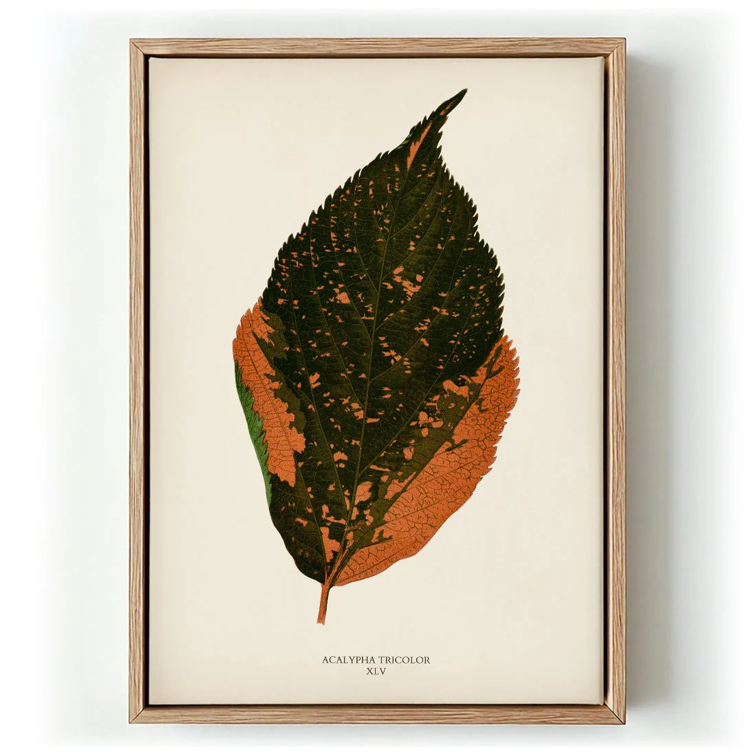
Let The Good Times Roll Art Print
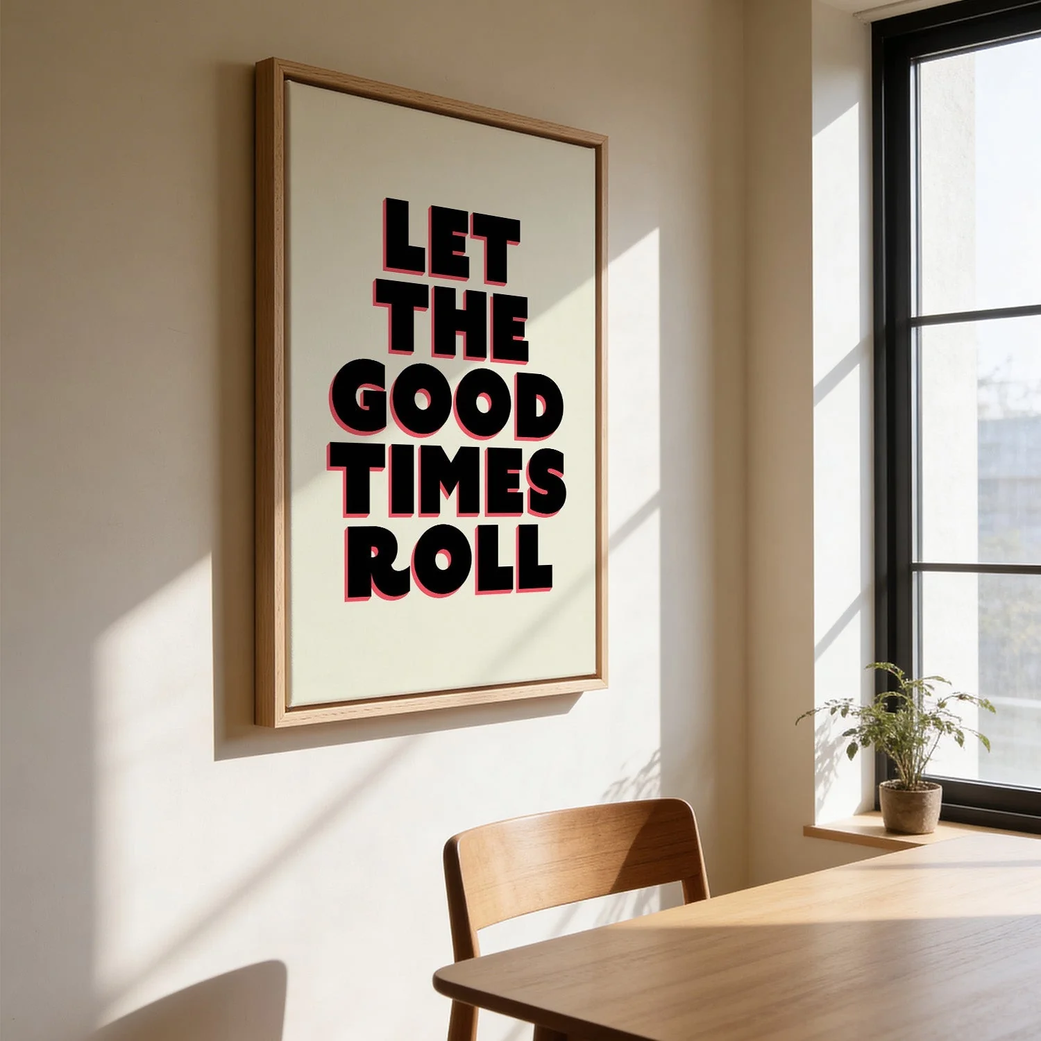
Nico Tracey's design commands attention through confident lettering and a stripped-back graphic sensibility. The phrase sits bold and unapologetic against a clean ground, its weight and spacing carefully calibrated to feel both retro and entirely current. This is typography as art — where the message and the form are inseparable, and the visual rhythm of the letters carries as much meaning as the words themselves. The composition is precise, almost muscular, rooted in the tradition of mid-century graphic design.
As a canvas print, the bold lines and flat graphic tones gain an unexpected warmth from the woven surface. The texture adds dimension without softening the design's clarity — a canvas art print that holds its own with real presence.
Original: $44.15
-65%$44.15
$15.45More Images

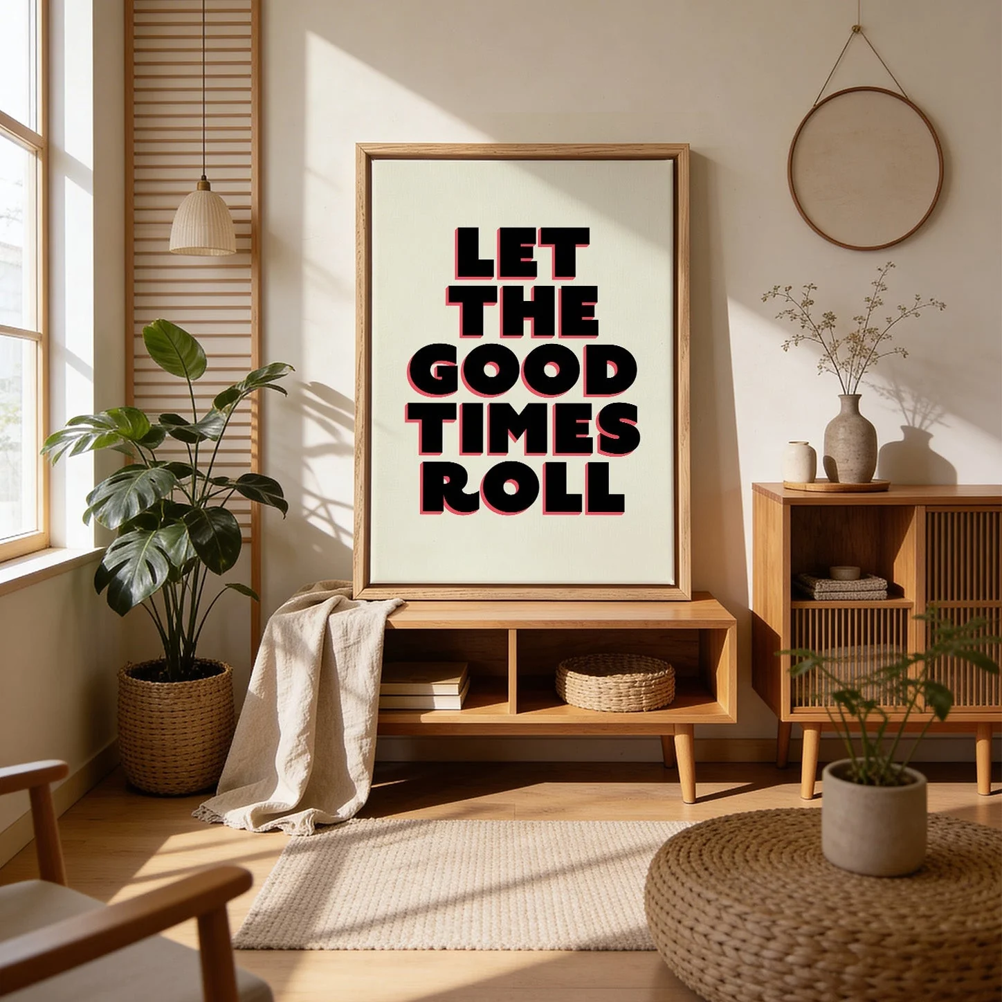


Let The Good Times Roll Art Print
Nico Tracey's design commands attention through confident lettering and a stripped-back graphic sensibility. The phrase sits bold and unapologetic against a clean ground, its weight and spacing carefully calibrated to feel both retro and entirely current. This is typography as art — where the message and the form are inseparable, and the visual rhythm of the letters carries as much meaning as the words themselves. The composition is precise, almost muscular, rooted in the tradition of mid-century graphic design.
As a canvas print, the bold lines and flat graphic tones gain an unexpected warmth from the woven surface. The texture adds dimension without softening the design's clarity — a canvas art print that holds its own with real presence.
Product Information
Product Information
Shipping & Returns
Shipping & Returns
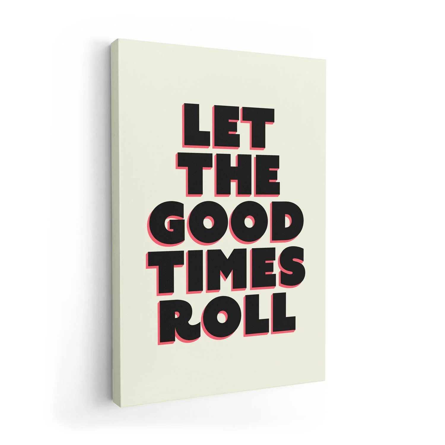
Description
Nico Tracey's design commands attention through confident lettering and a stripped-back graphic sensibility. The phrase sits bold and unapologetic against a clean ground, its weight and spacing carefully calibrated to feel both retro and entirely current. This is typography as art — where the message and the form are inseparable, and the visual rhythm of the letters carries as much meaning as the words themselves. The composition is precise, almost muscular, rooted in the tradition of mid-century graphic design.
As a canvas print, the bold lines and flat graphic tones gain an unexpected warmth from the woven surface. The texture adds dimension without softening the design's clarity — a canvas art print that holds its own with real presence.