West Side Story by Mid-century Theatre
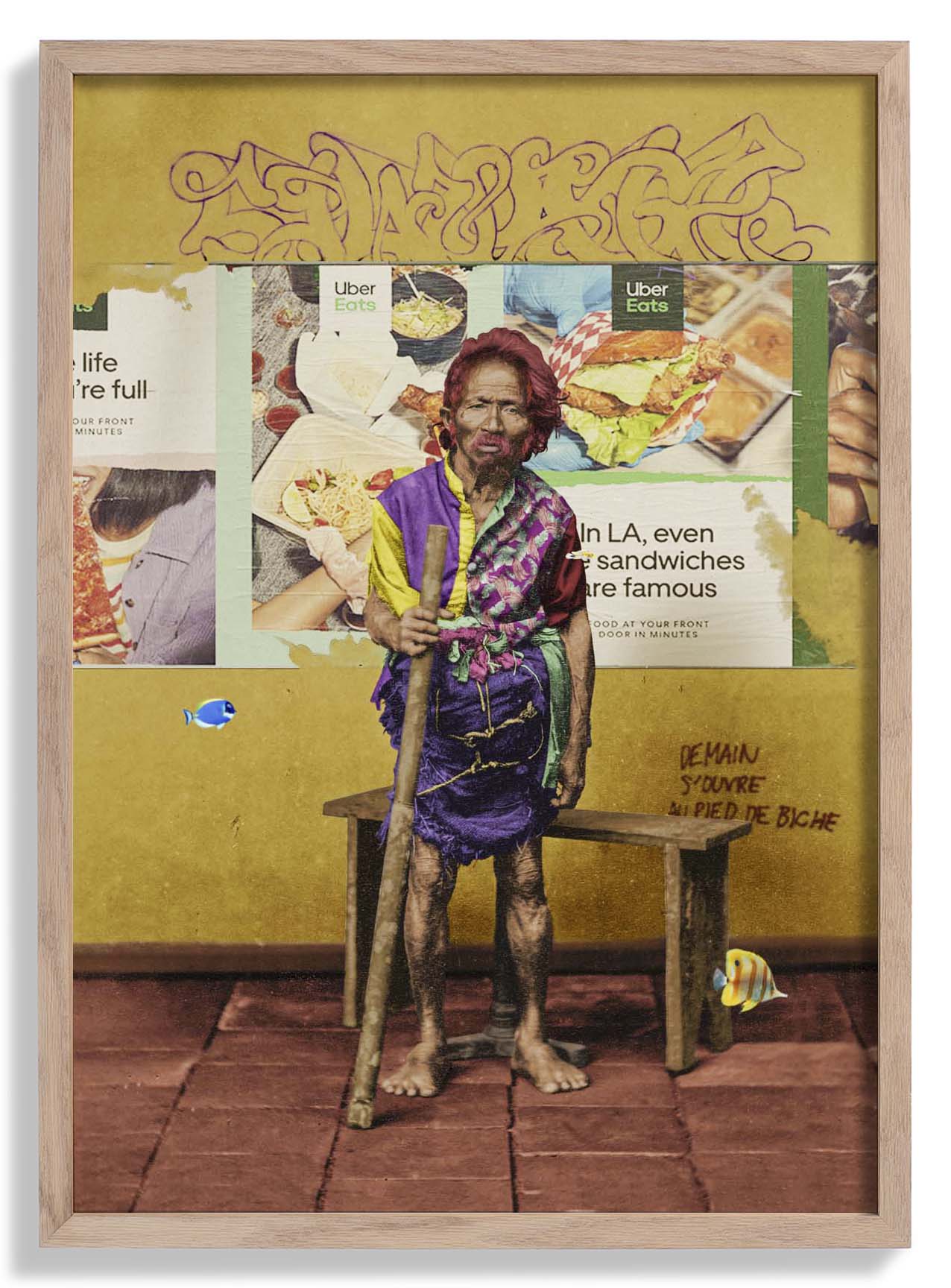
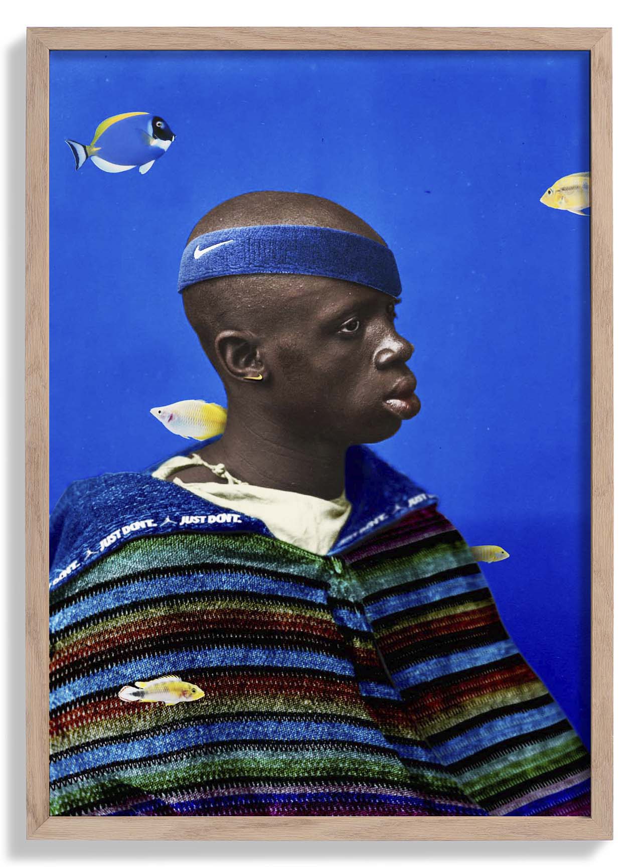
This version of the West Side Story theatre poster approaches the material through a cooler, more typographically driven lens. The composition leans on the structural logic of mid-century graphic design — clean hierarchy, deliberate white space, letterforms that carry as much visual weight as the imagery. Where other interpretations of this production emphasised movement and conflict, this one finds its power in stillness and restraint. The result is a piece that ages exceptionally well: it looks as considered today as it did when Broadway design was at its most ambitious.
Produced as a fine art print in our Berlin studio, the typographic precision and tonal balance of this design reproduce beautifully on archival matte paper — linework stays razor-sharp and the restrained palette reads exactly as intended.
Original: $17.42
-65%$17.42
$6.10More Images


West Side Story by Mid-century Theatre
This version of the West Side Story theatre poster approaches the material through a cooler, more typographically driven lens. The composition leans on the structural logic of mid-century graphic design — clean hierarchy, deliberate white space, letterforms that carry as much visual weight as the imagery. Where other interpretations of this production emphasised movement and conflict, this one finds its power in stillness and restraint. The result is a piece that ages exceptionally well: it looks as considered today as it did when Broadway design was at its most ambitious.
Produced as a fine art print in our Berlin studio, the typographic precision and tonal balance of this design reproduce beautifully on archival matte paper — linework stays razor-sharp and the restrained palette reads exactly as intended.
Product Information
Product Information
Shipping & Returns
Shipping & Returns
Description
This version of the West Side Story theatre poster approaches the material through a cooler, more typographically driven lens. The composition leans on the structural logic of mid-century graphic design — clean hierarchy, deliberate white space, letterforms that carry as much visual weight as the imagery. Where other interpretations of this production emphasised movement and conflict, this one finds its power in stillness and restraint. The result is a piece that ages exceptionally well: it looks as considered today as it did when Broadway design was at its most ambitious.
Produced as a fine art print in our Berlin studio, the typographic precision and tonal balance of this design reproduce beautifully on archival matte paper — linework stays razor-sharp and the restrained palette reads exactly as intended.