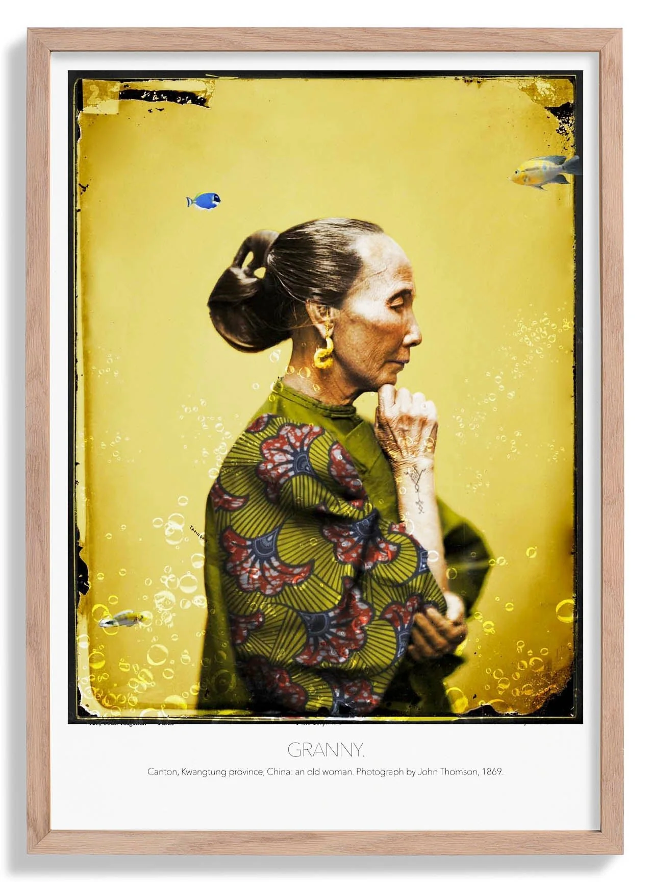
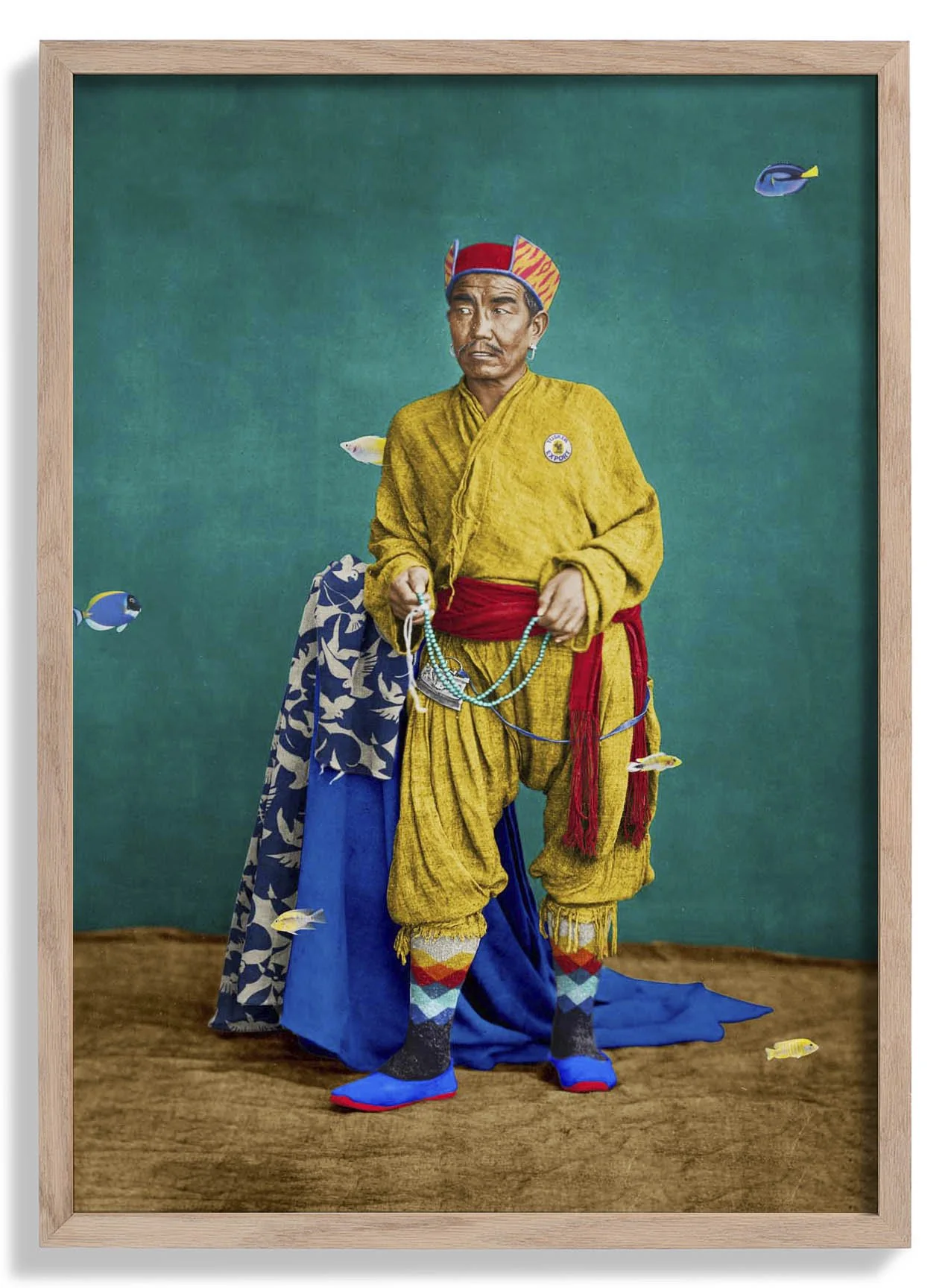
The Future Belongs to the Curious
Set against a warm, aged background, this vintage typographic print pairs a confident sans-serif headline with delicate hand-lettered flourishes beneath — a design sensibility rooted in early twentieth-century illustration and commercial art. The restrained colour palette of deep ink tones on cream gives the piece an heirloom quality, as though pulled from a well-loved periodical. The composition centres the eye on the message itself, letting the words carry the visual weight without distraction from ornament or imagery.
As an archival fine art print, the ink sits dense and even across the surface — letterforms stay crisp, negative space reads clean, and the tonal contrast between text and background holds precisely as intended.
Original: $17.42
-65%$17.42
$6.10More Images


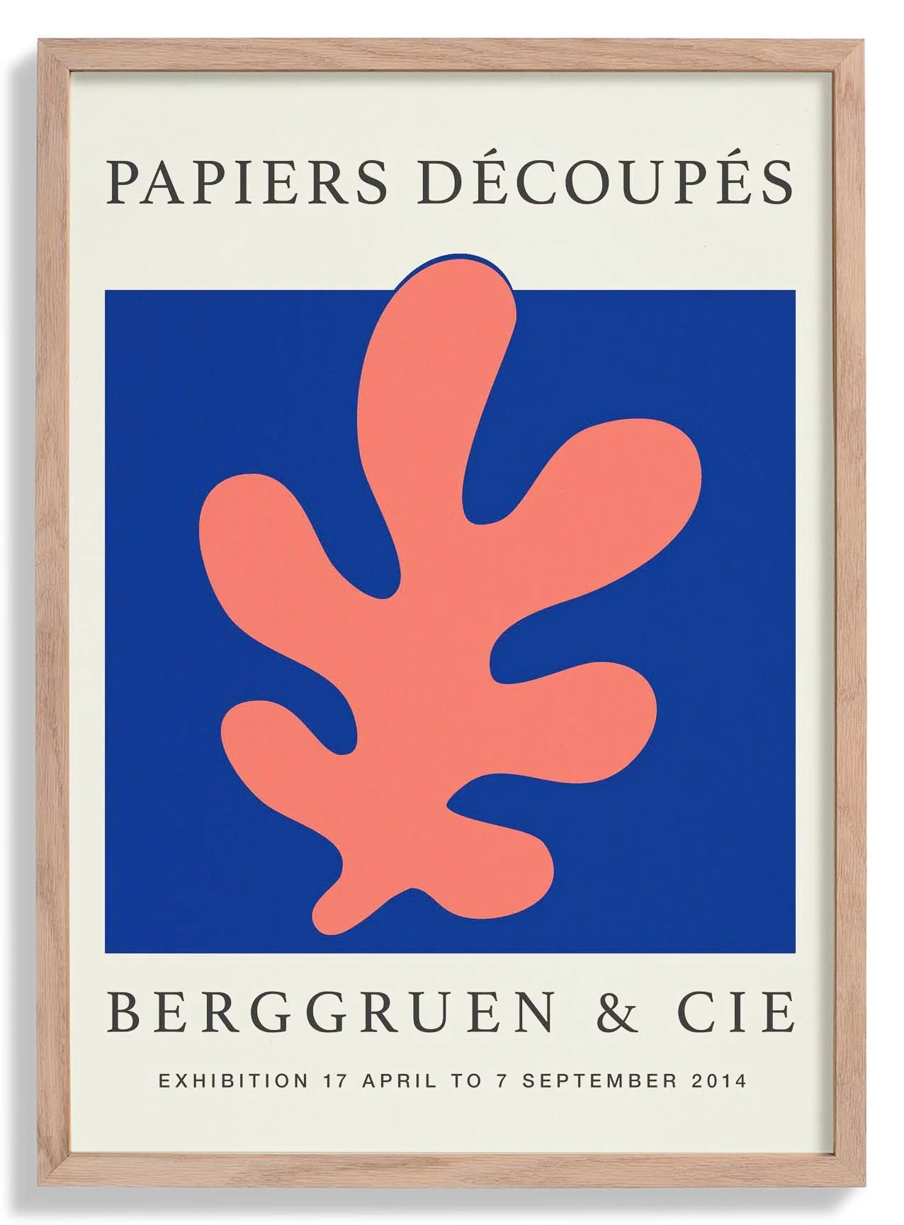
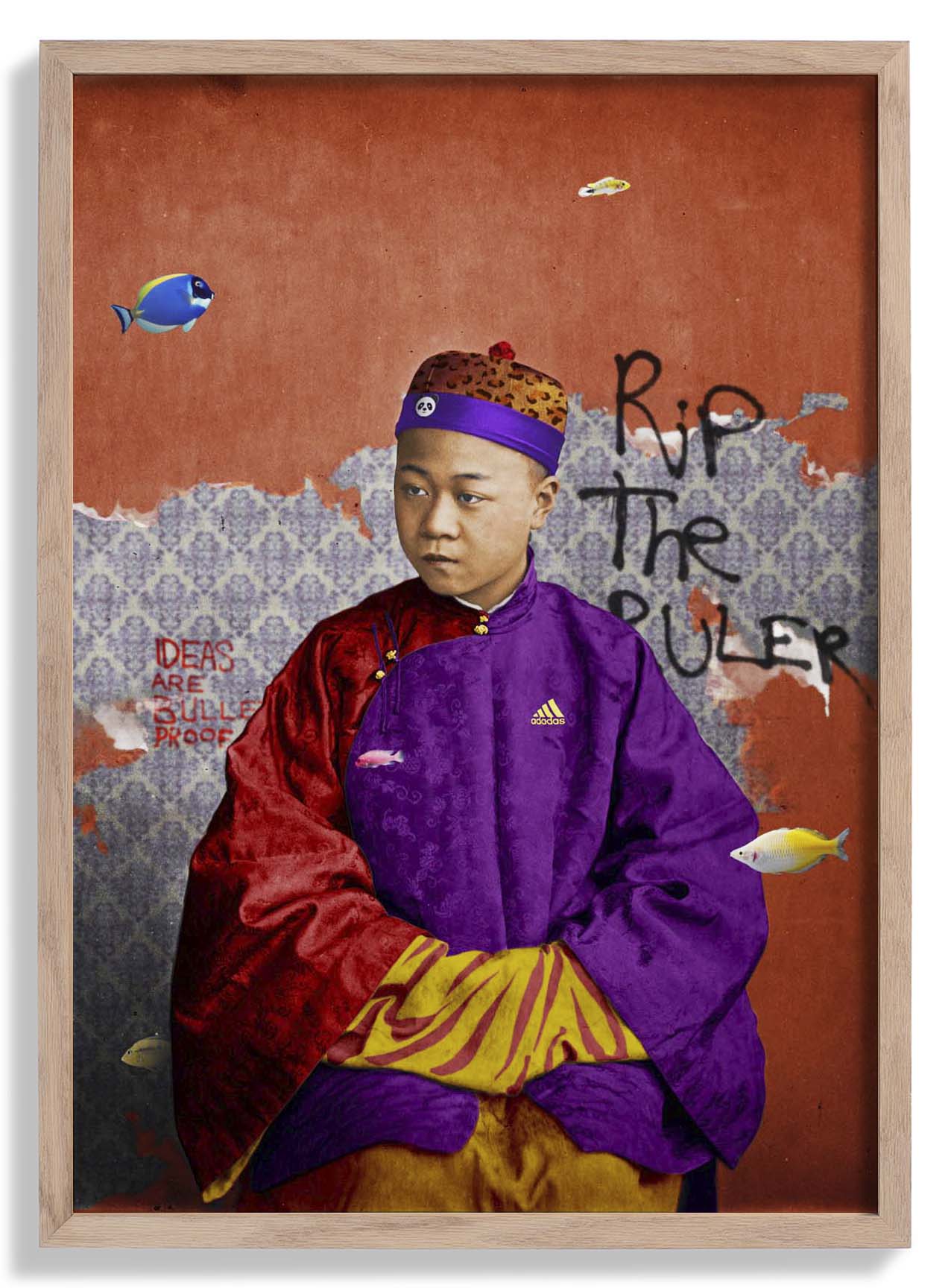
The Future Belongs to the Curious
Set against a warm, aged background, this vintage typographic print pairs a confident sans-serif headline with delicate hand-lettered flourishes beneath — a design sensibility rooted in early twentieth-century illustration and commercial art. The restrained colour palette of deep ink tones on cream gives the piece an heirloom quality, as though pulled from a well-loved periodical. The composition centres the eye on the message itself, letting the words carry the visual weight without distraction from ornament or imagery.
As an archival fine art print, the ink sits dense and even across the surface — letterforms stay crisp, negative space reads clean, and the tonal contrast between text and background holds precisely as intended.
Product Information
Product Information
Shipping & Returns
Shipping & Returns
Description
Set against a warm, aged background, this vintage typographic print pairs a confident sans-serif headline with delicate hand-lettered flourishes beneath — a design sensibility rooted in early twentieth-century illustration and commercial art. The restrained colour palette of deep ink tones on cream gives the piece an heirloom quality, as though pulled from a well-loved periodical. The composition centres the eye on the message itself, letting the words carry the visual weight without distraction from ornament or imagery.
As an archival fine art print, the ink sits dense and even across the surface — letterforms stay crisp, negative space reads clean, and the tonal contrast between text and background holds precisely as intended.