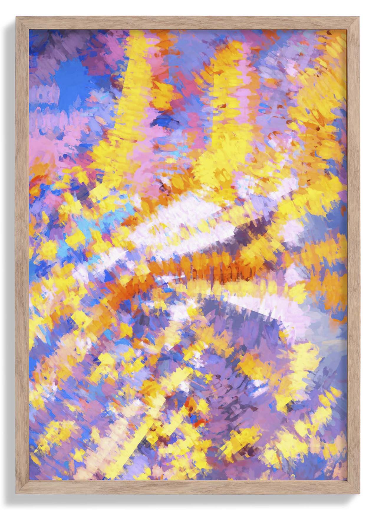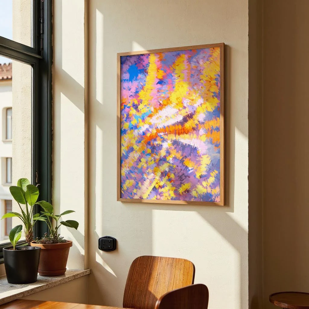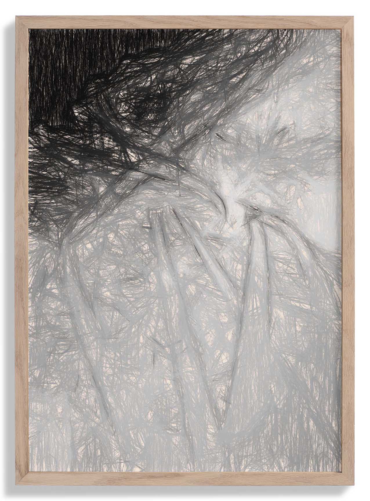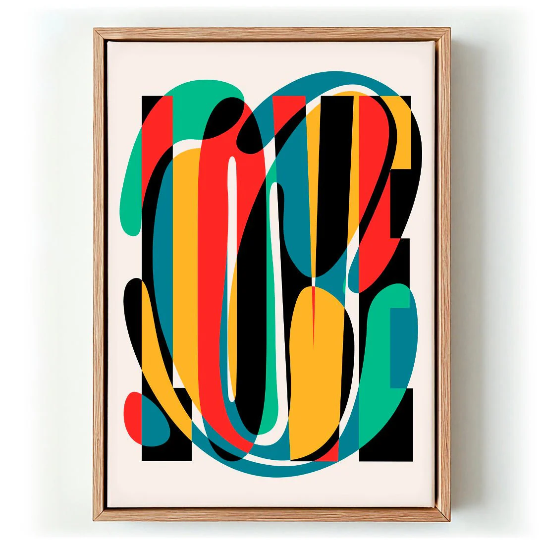
Love Abstract Design by Retrodrome
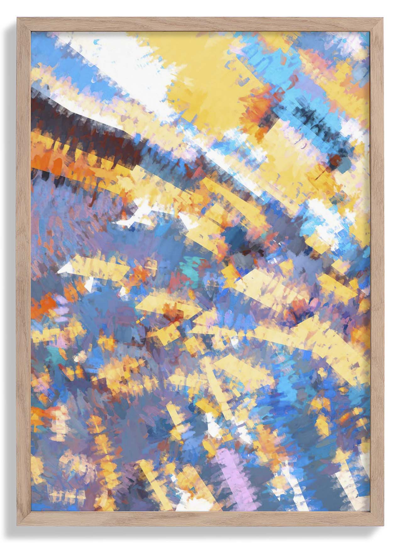
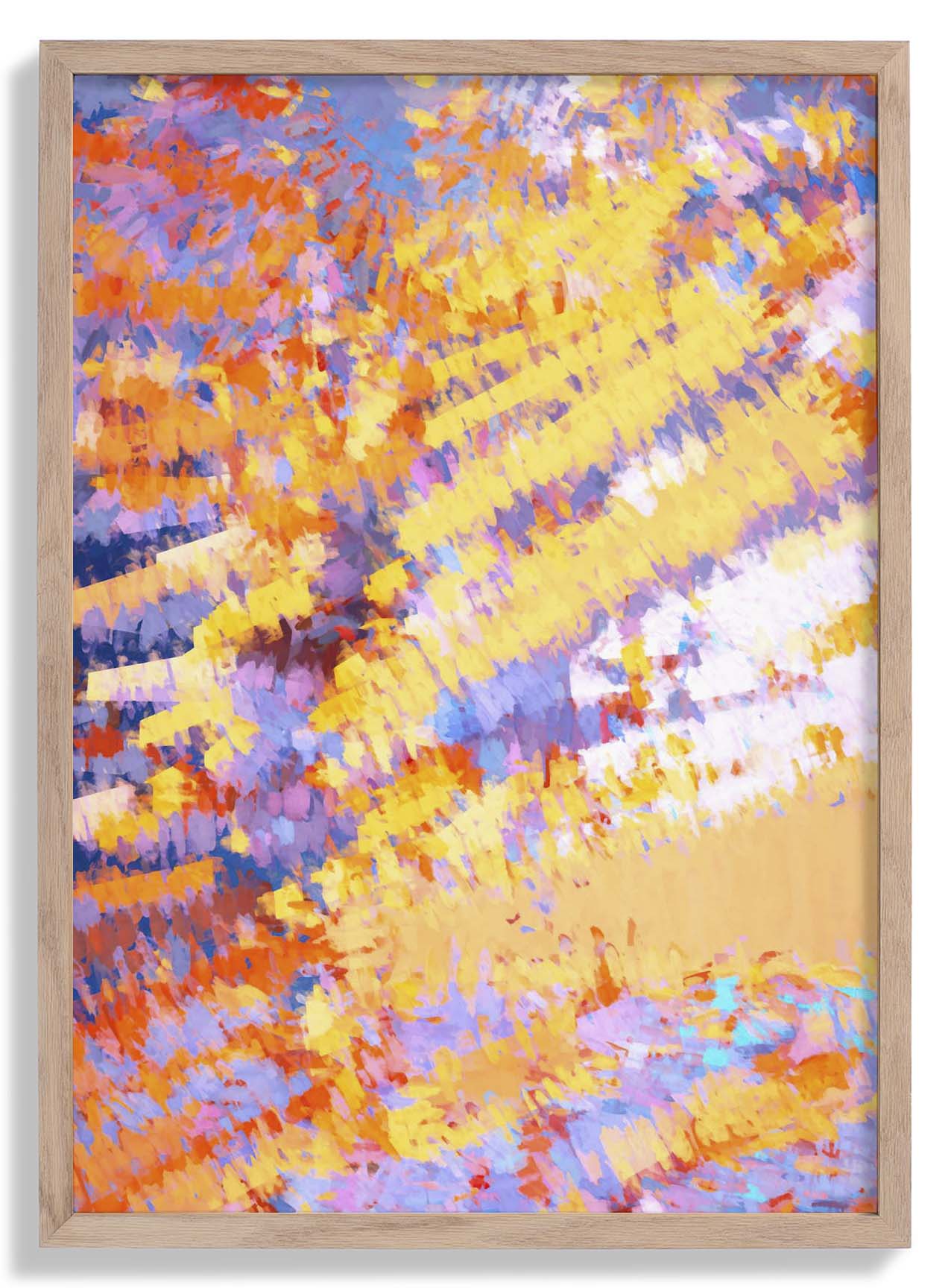
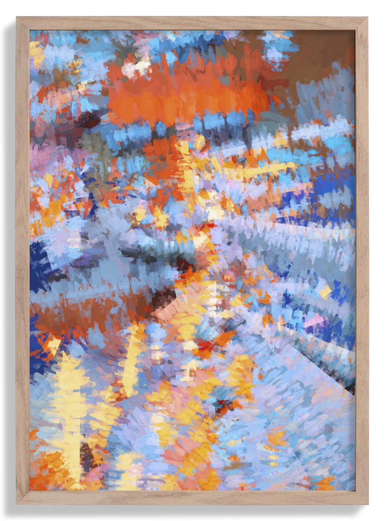
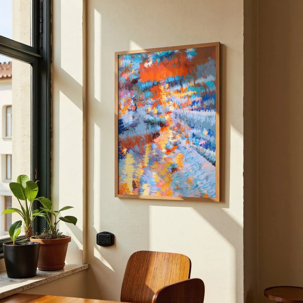
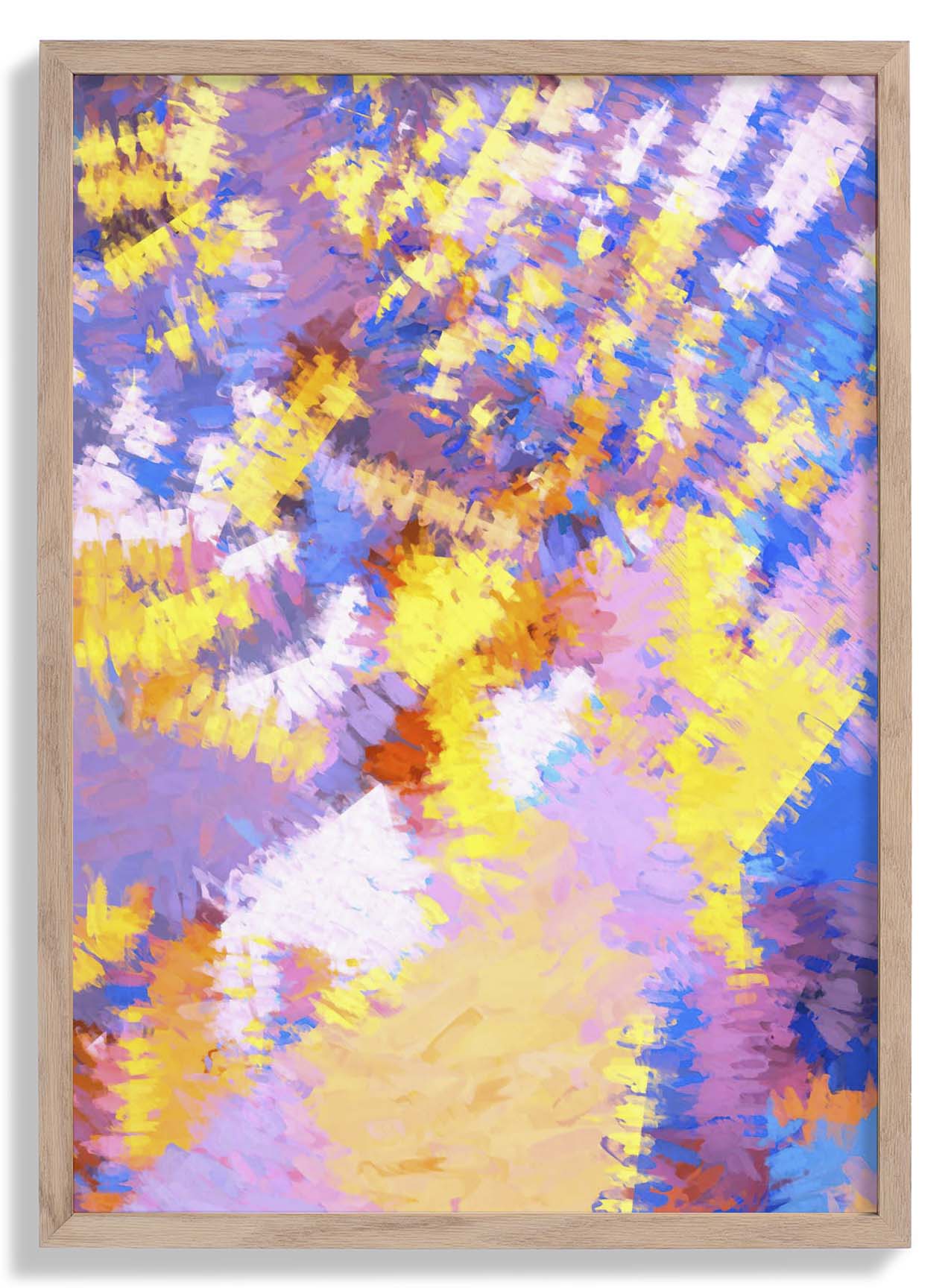
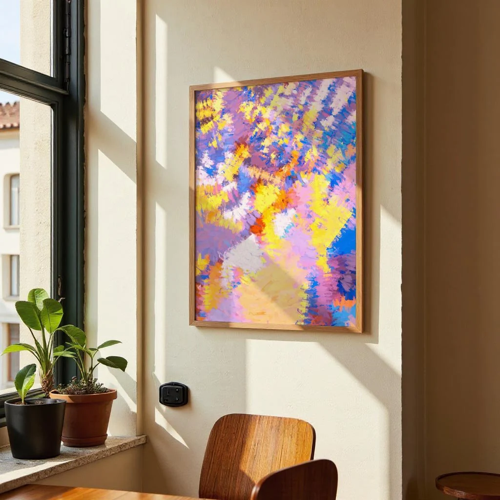
The word LOVE is treated not as sentiment but as raw visual material — letterforms broken into geometric components and reassembled as pure abstraction. Retrodrome works at the intersection of typography and graphic design, where letters function simultaneously as language and as shape. Strong lines, flat colour, and a tightly controlled compositional grid keep the image from tipping into decoration. The result is a piece that asks you to see familiar letters afresh, finding architecture in the alphabet and meaning in form. Bold, considered, and entirely without nostalgia for conventional type.
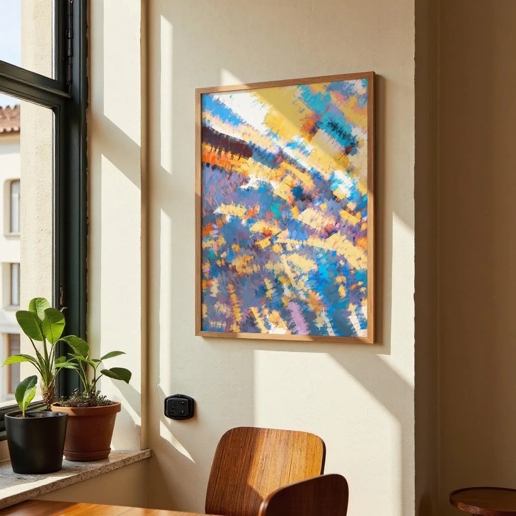
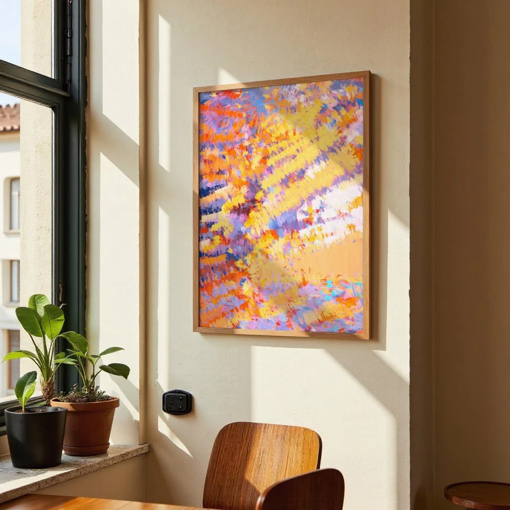
Produced as a canvas print in Kuriosis's Berlin studio, the woven surface brings a painterly tactile quality to this graphic work. Bold typographic forms read powerfully on canvas, gaining depth and presence that makes the composition feel genuinely sculptural at larger sizes.
Original: $104.57
-65%$104.57
$36.60More Images


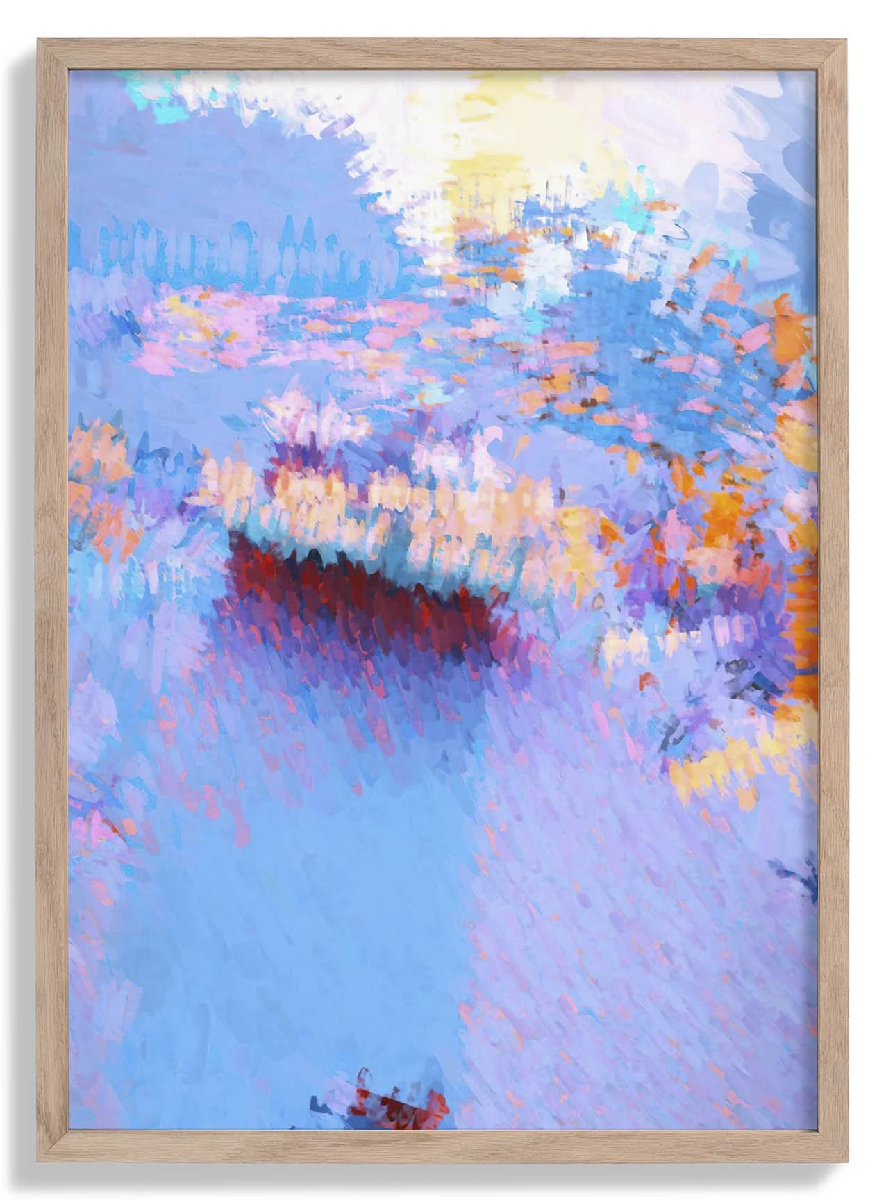
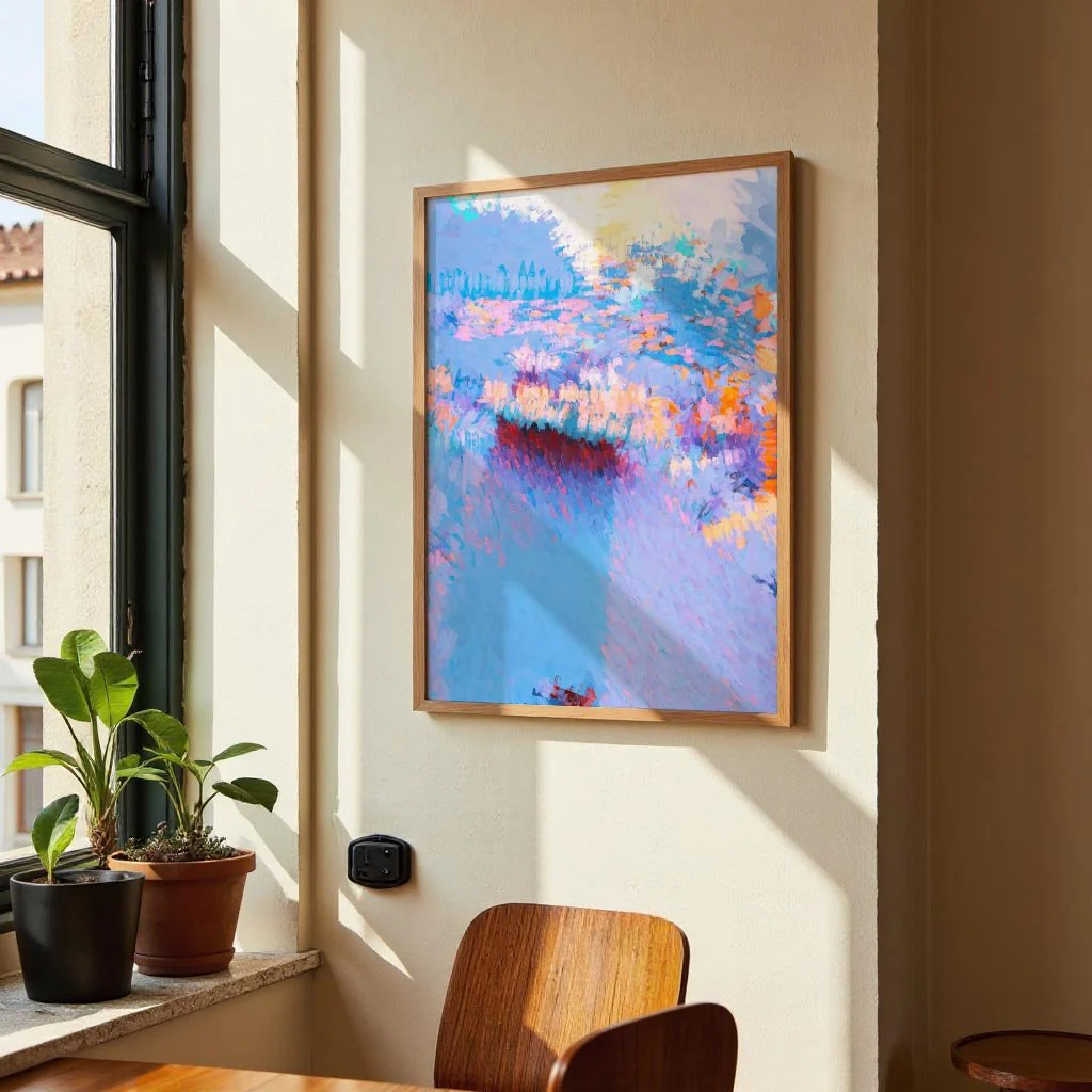
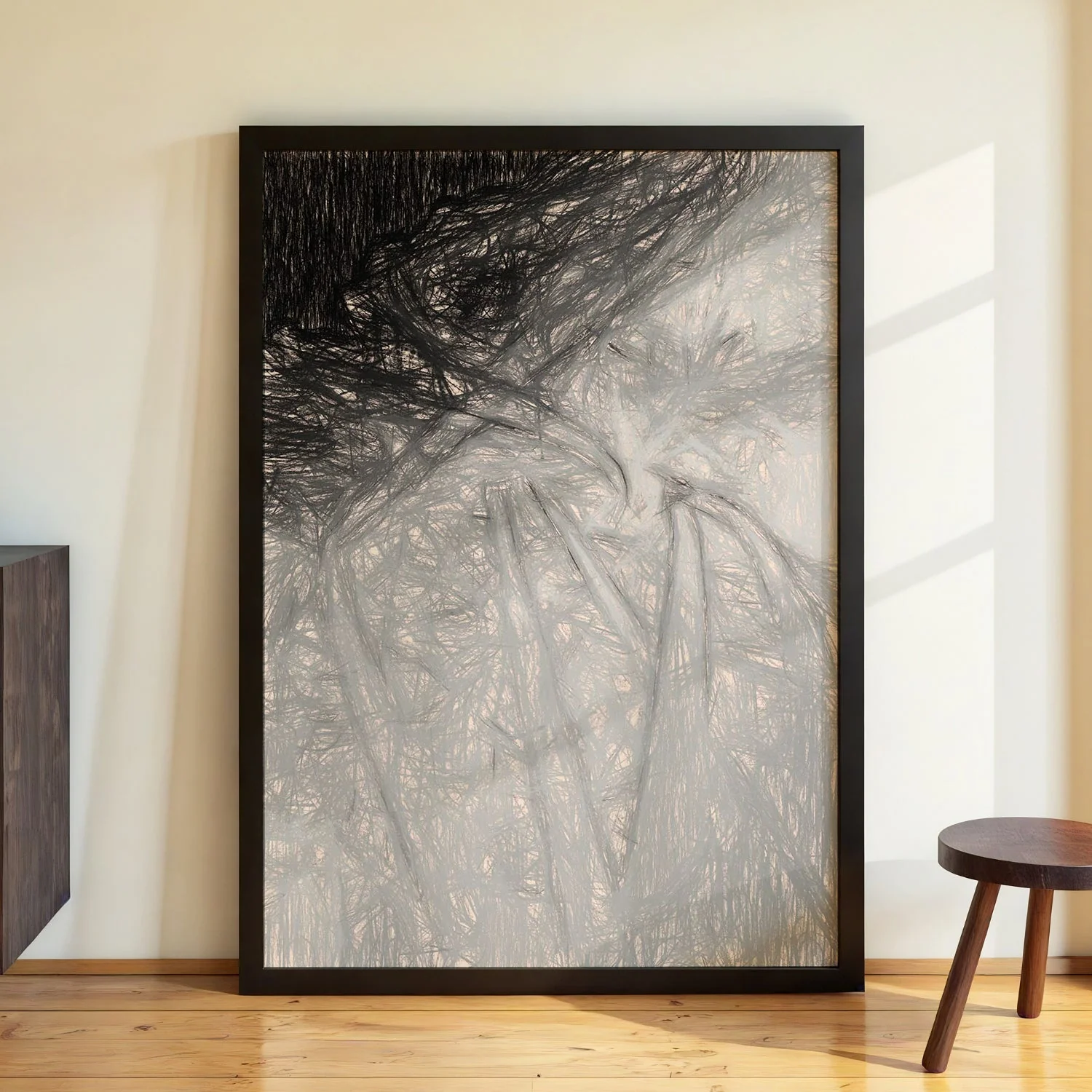
Love Abstract Design by Retrodrome
The word LOVE is treated not as sentiment but as raw visual material — letterforms broken into geometric components and reassembled as pure abstraction. Retrodrome works at the intersection of typography and graphic design, where letters function simultaneously as language and as shape. Strong lines, flat colour, and a tightly controlled compositional grid keep the image from tipping into decoration. The result is a piece that asks you to see familiar letters afresh, finding architecture in the alphabet and meaning in form. Bold, considered, and entirely without nostalgia for conventional type.
Produced as a canvas print in Kuriosis's Berlin studio, the woven surface brings a painterly tactile quality to this graphic work. Bold typographic forms read powerfully on canvas, gaining depth and presence that makes the composition feel genuinely sculptural at larger sizes.
Product Information
Product Information
Shipping & Returns
Shipping & Returns
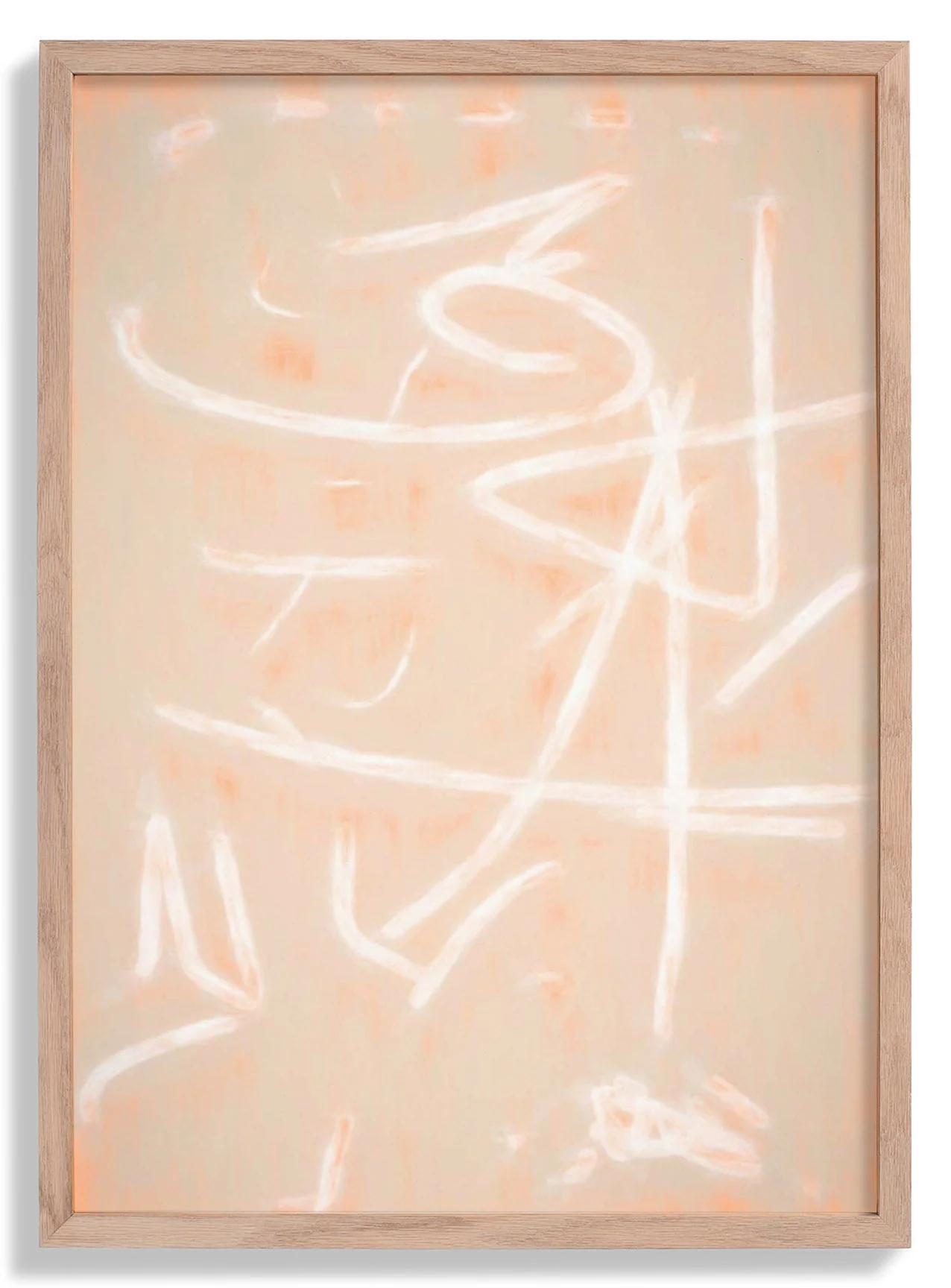
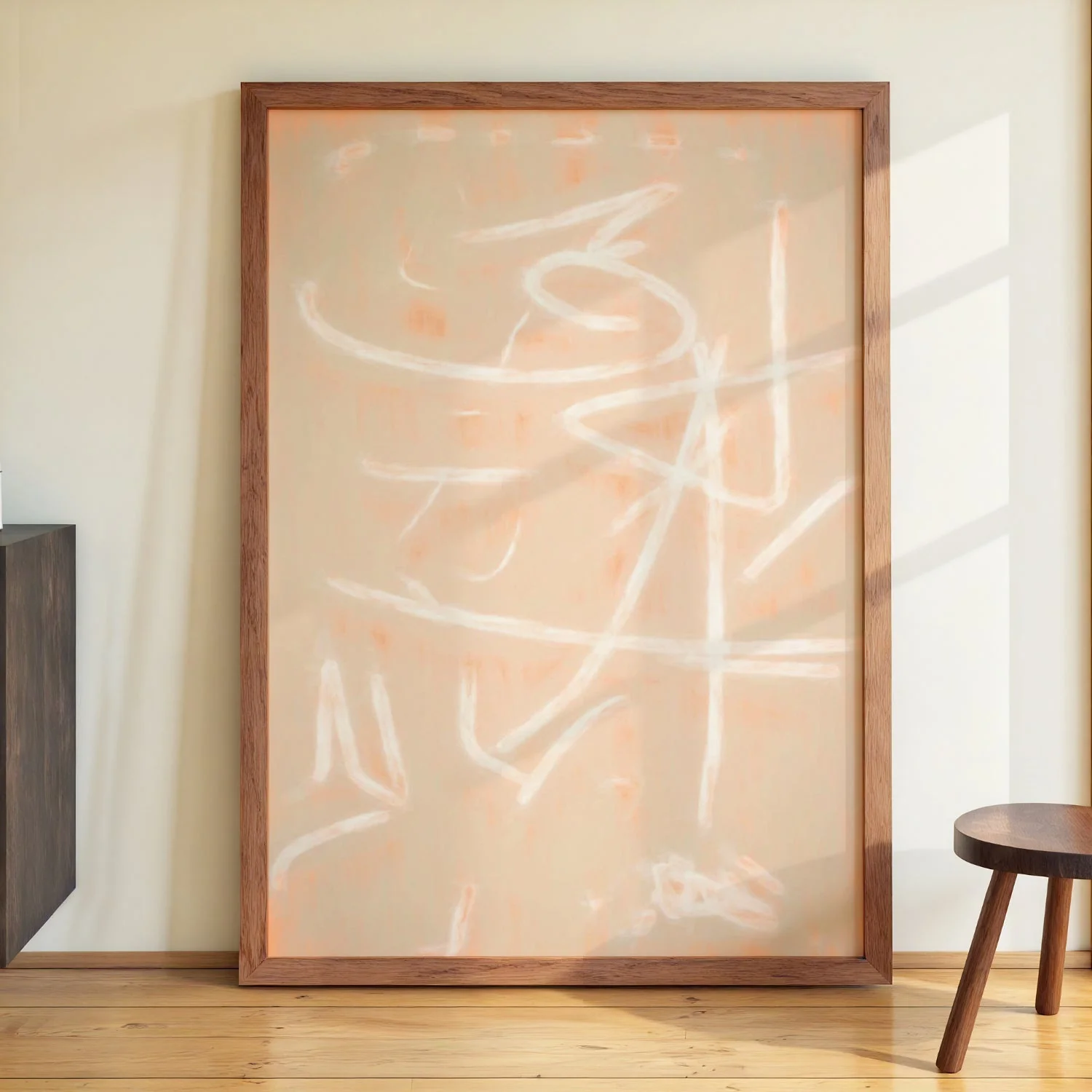
Description
The word LOVE is treated not as sentiment but as raw visual material — letterforms broken into geometric components and reassembled as pure abstraction. Retrodrome works at the intersection of typography and graphic design, where letters function simultaneously as language and as shape. Strong lines, flat colour, and a tightly controlled compositional grid keep the image from tipping into decoration. The result is a piece that asks you to see familiar letters afresh, finding architecture in the alphabet and meaning in form. Bold, considered, and entirely without nostalgia for conventional type.
Produced as a canvas print in Kuriosis's Berlin studio, the woven surface brings a painterly tactile quality to this graphic work. Bold typographic forms read powerfully on canvas, gaining depth and presence that makes the composition feel genuinely sculptural at larger sizes.