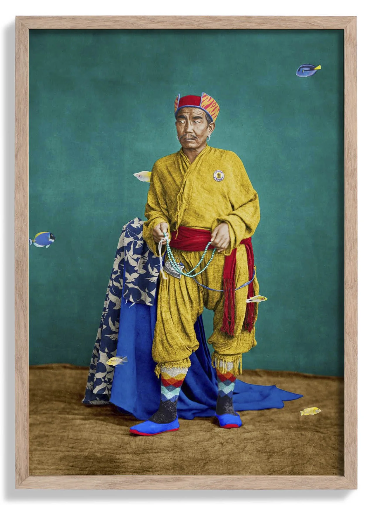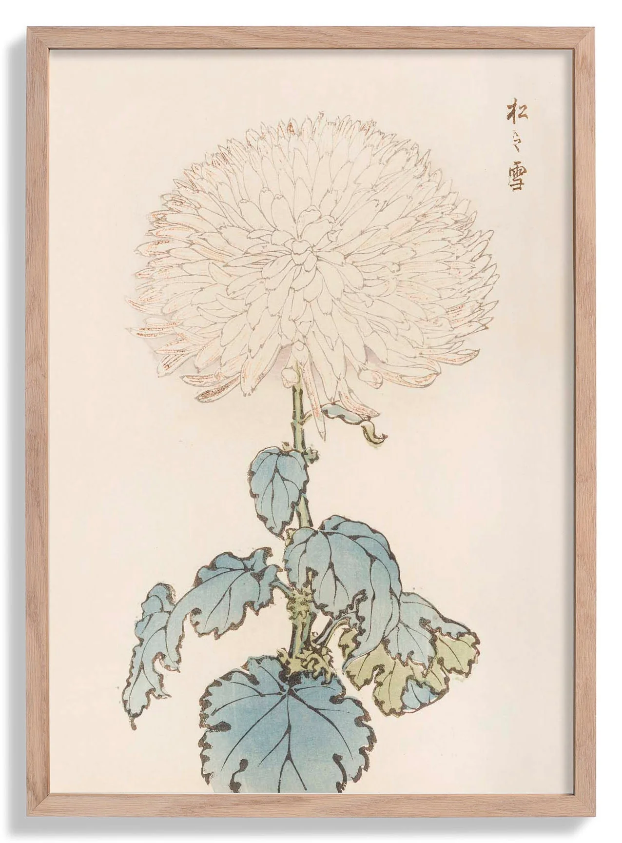
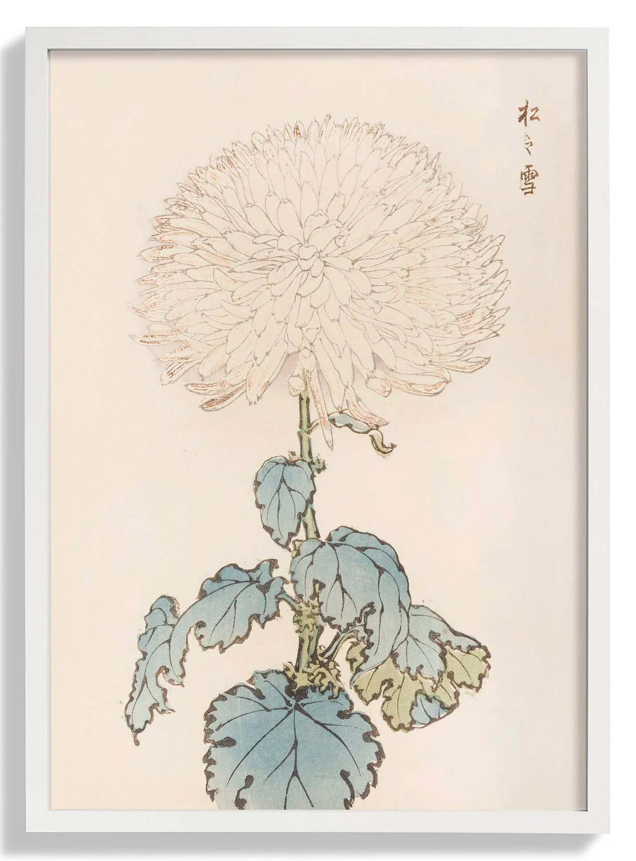
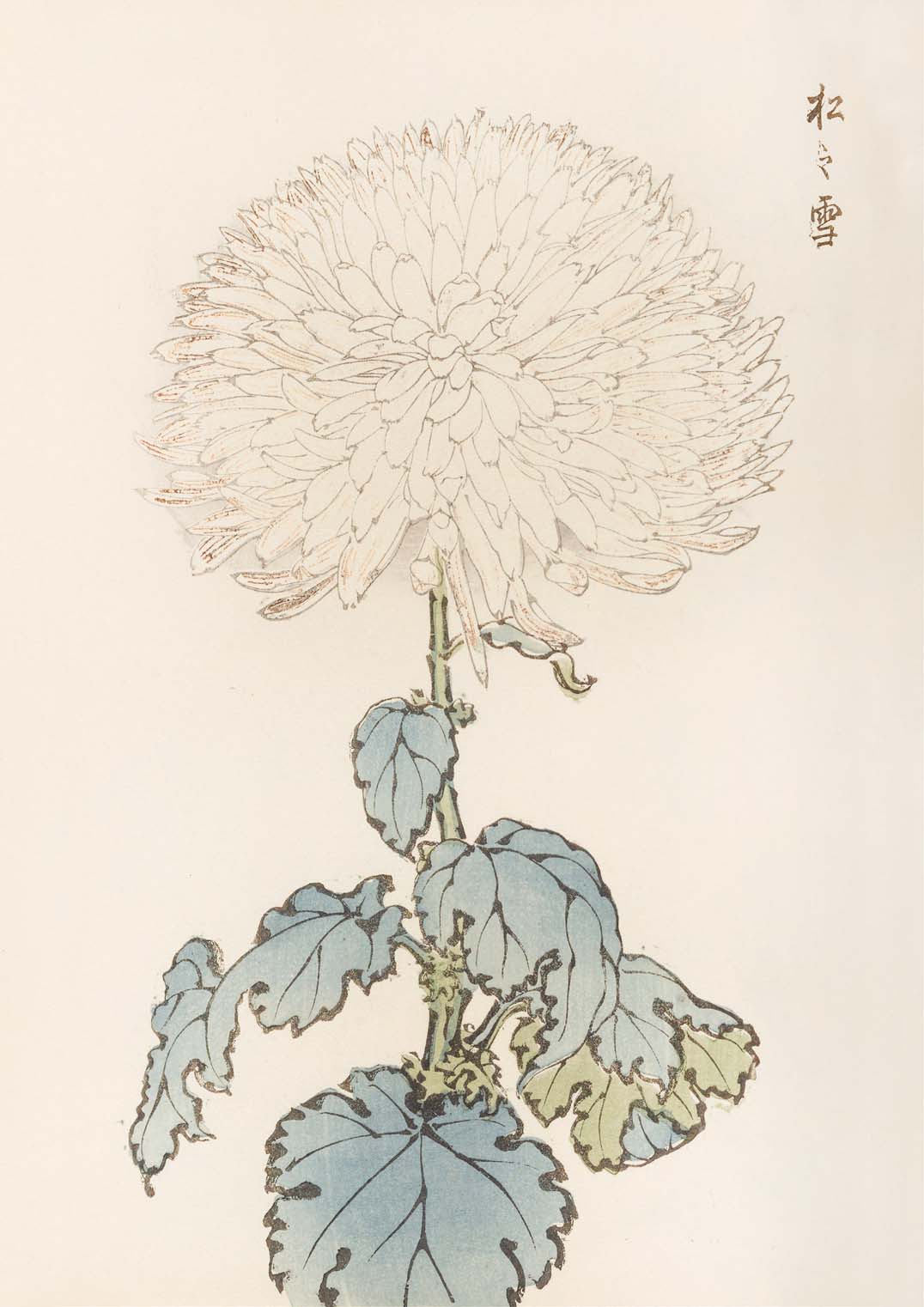
Keika hyakugiku Pl.19 by Keika Hosegawa
Plate 19 captures a bicolour chrysanthemum cultivar — pale at the petal tips, deepening to a warm amber toward the centre — a chromatic effect that Hasegawa renders through precise tonal layering rather than obvious gradients. The bloom is shown fully open, its petals fanning outward in a broad, generous span that fills the upper half of the composition. Ink lines are confident and unhurried, tracing each petal's curve with a single, unbroken stroke. This plate exemplifies the series' core ambition: to document with absolute fidelity while producing something unmistakably beautiful in the Meiji tradition of woodblock botanical illustration.
Produced as a fine art print in our Berlin studio, this Japanese poster renders the bicolour tonal subtlety and confident ink linework of Hasegawa's original with archival precision and lasting colour fidelity.
Original: $17.42
-65%$17.42
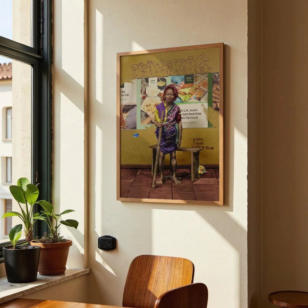
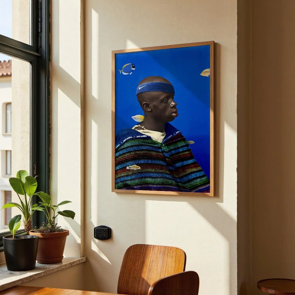
$6.10More Images


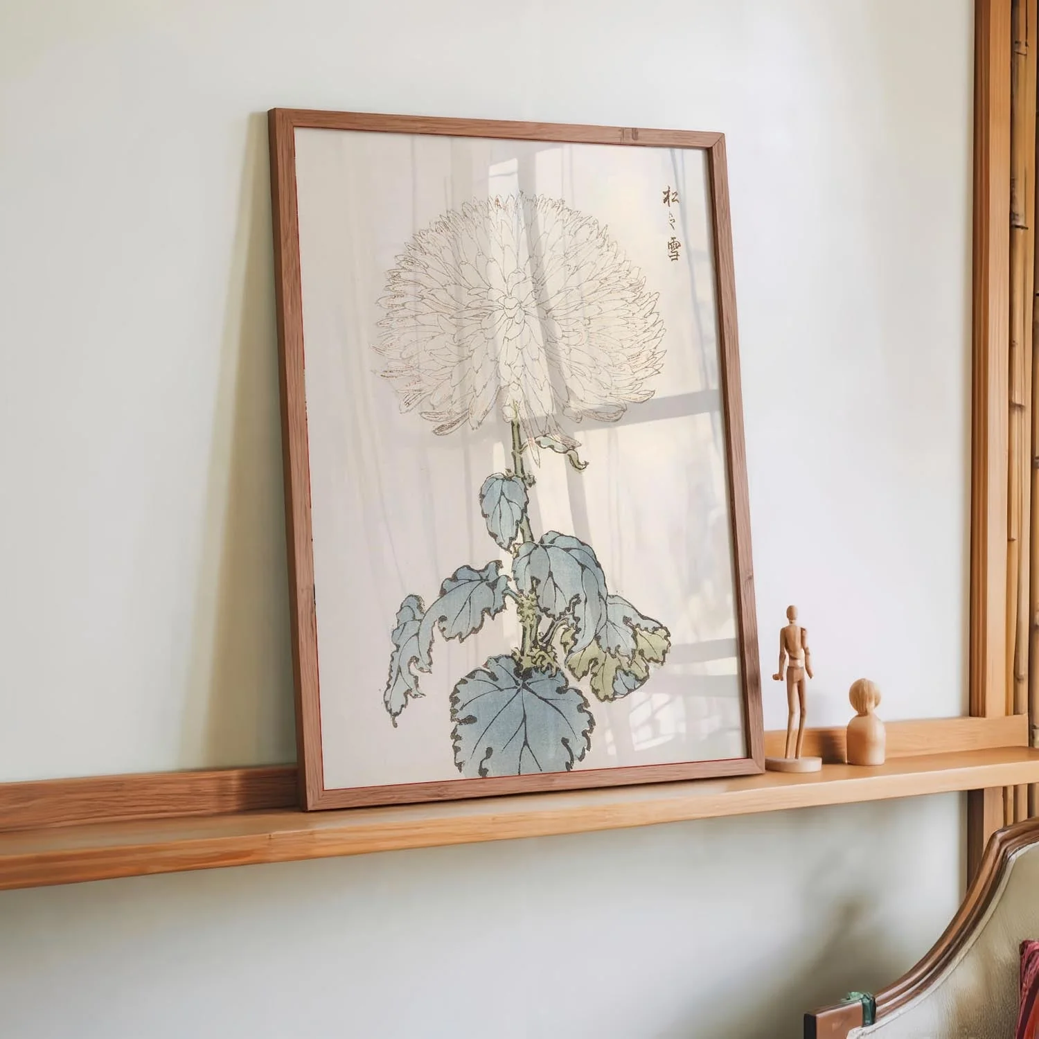
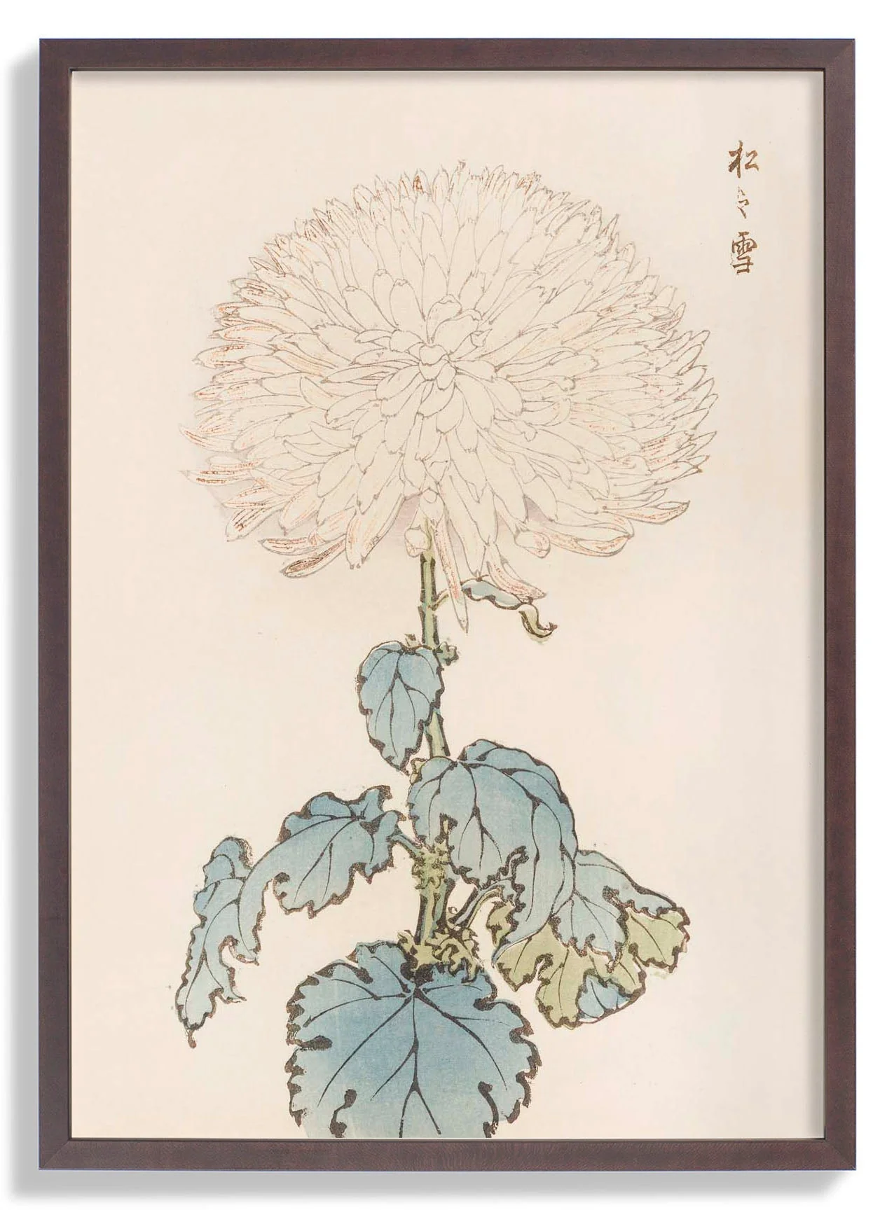
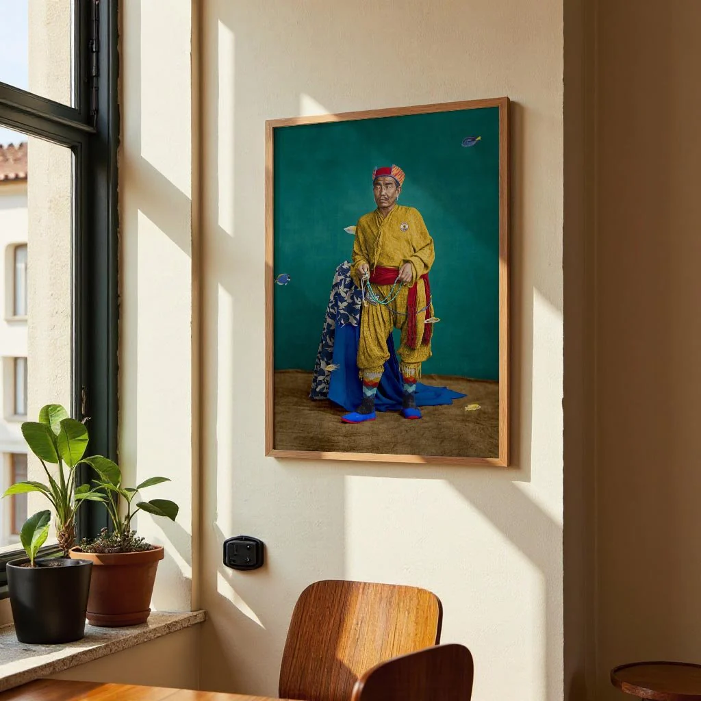
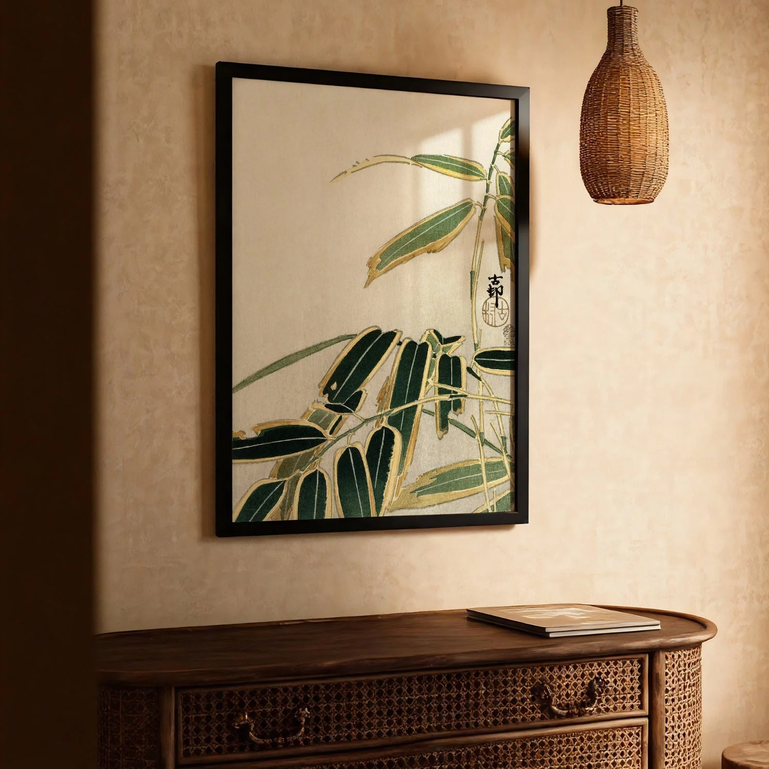
Keika hyakugiku Pl.19 by Keika Hosegawa
Plate 19 captures a bicolour chrysanthemum cultivar — pale at the petal tips, deepening to a warm amber toward the centre — a chromatic effect that Hasegawa renders through precise tonal layering rather than obvious gradients. The bloom is shown fully open, its petals fanning outward in a broad, generous span that fills the upper half of the composition. Ink lines are confident and unhurried, tracing each petal's curve with a single, unbroken stroke. This plate exemplifies the series' core ambition: to document with absolute fidelity while producing something unmistakably beautiful in the Meiji tradition of woodblock botanical illustration.
Produced as a fine art print in our Berlin studio, this Japanese poster renders the bicolour tonal subtlety and confident ink linework of Hasegawa's original with archival precision and lasting colour fidelity.
Product Information
Product Information
Shipping & Returns
Shipping & Returns
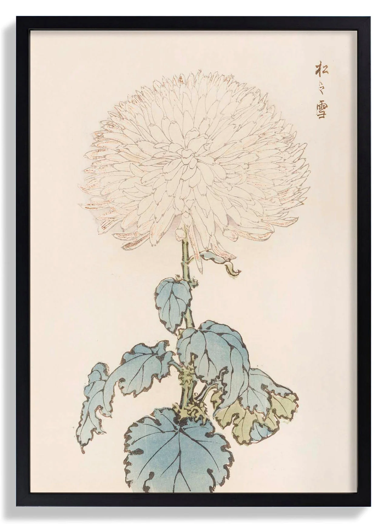
Description
Plate 19 captures a bicolour chrysanthemum cultivar — pale at the petal tips, deepening to a warm amber toward the centre — a chromatic effect that Hasegawa renders through precise tonal layering rather than obvious gradients. The bloom is shown fully open, its petals fanning outward in a broad, generous span that fills the upper half of the composition. Ink lines are confident and unhurried, tracing each petal's curve with a single, unbroken stroke. This plate exemplifies the series' core ambition: to document with absolute fidelity while producing something unmistakably beautiful in the Meiji tradition of woodblock botanical illustration.
Produced as a fine art print in our Berlin studio, this Japanese poster renders the bicolour tonal subtlety and confident ink linework of Hasegawa's original with archival precision and lasting colour fidelity.