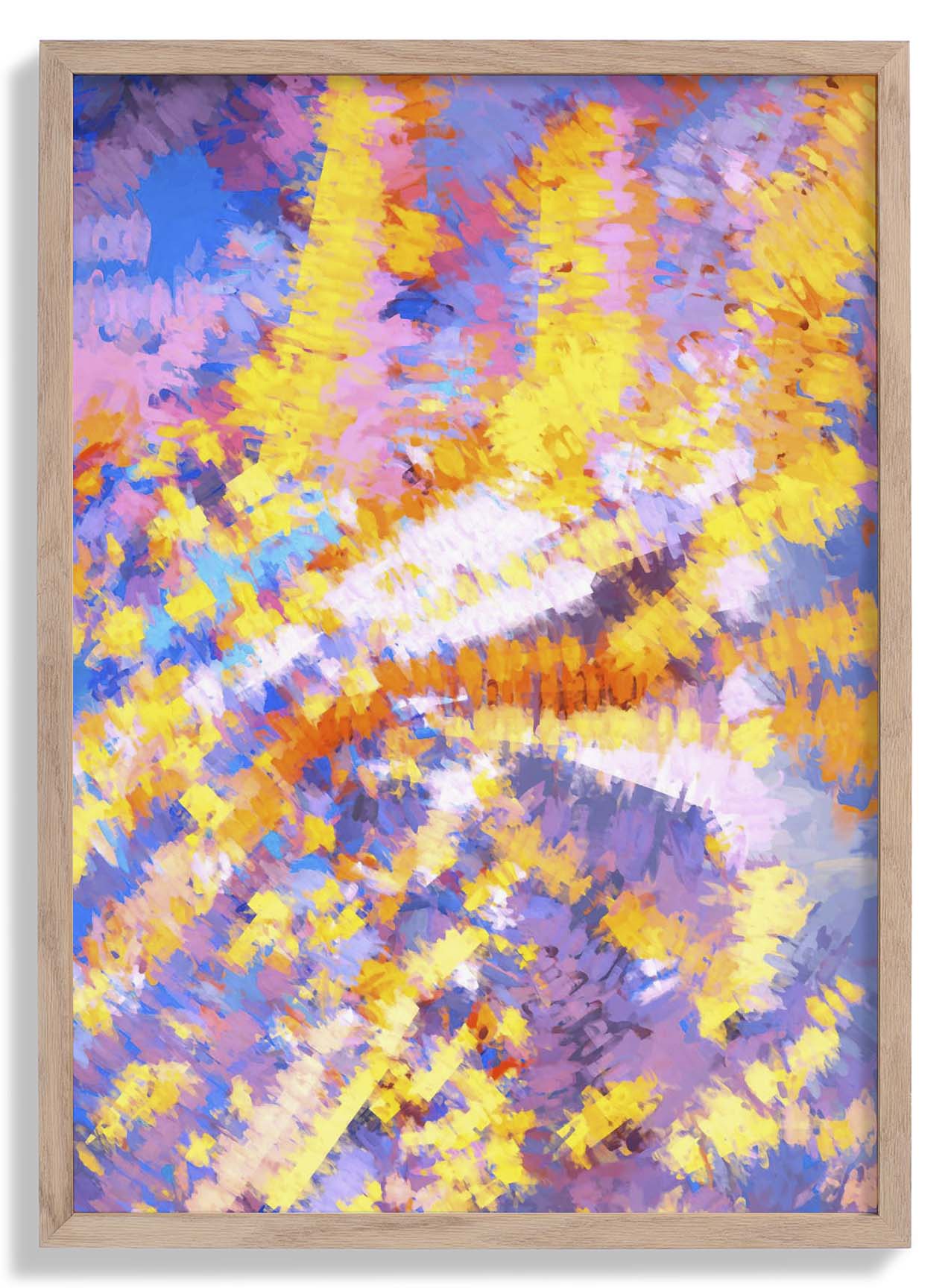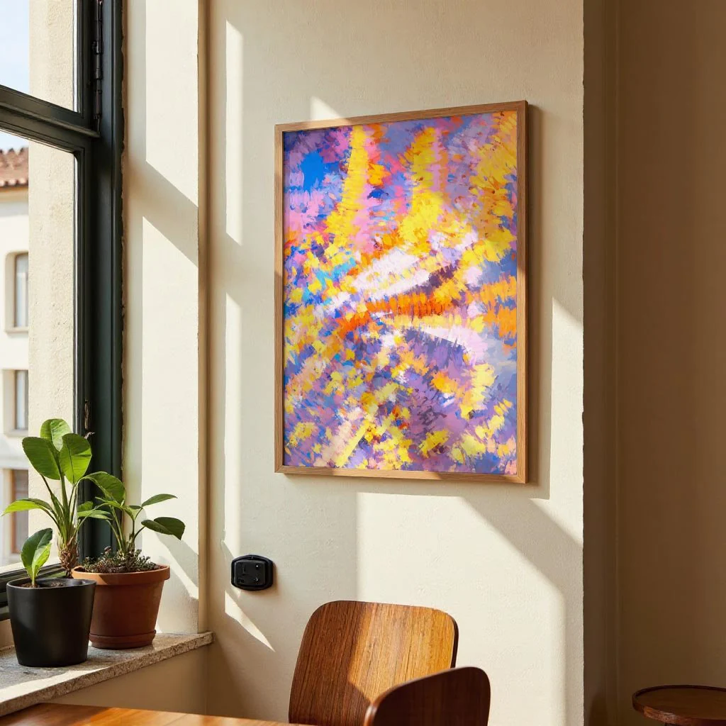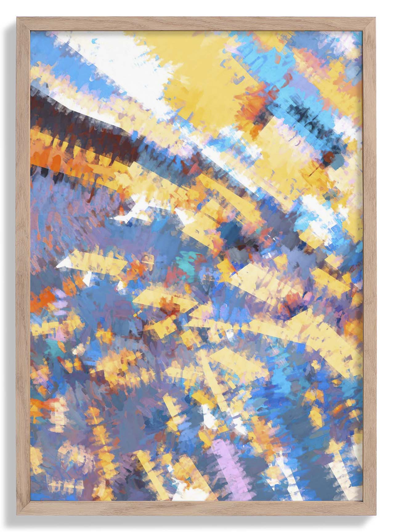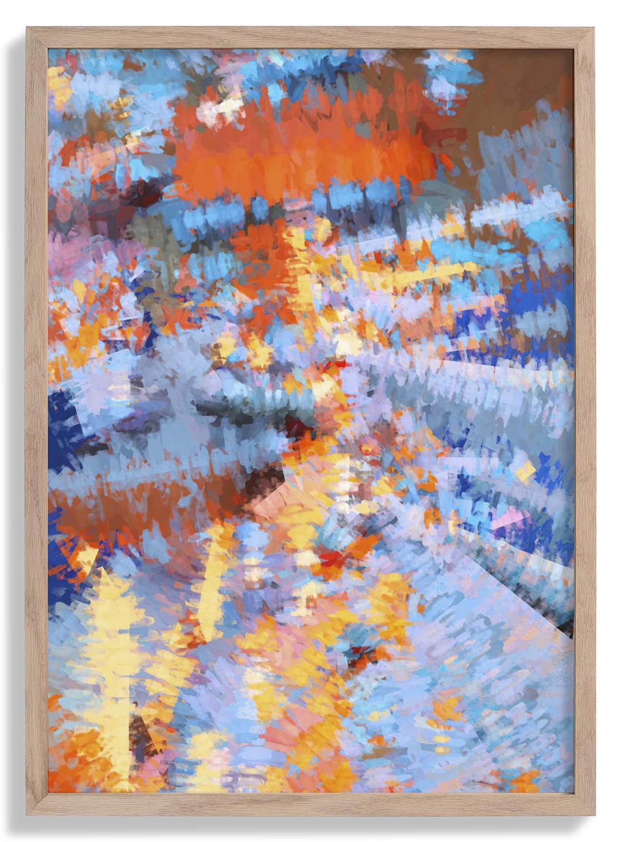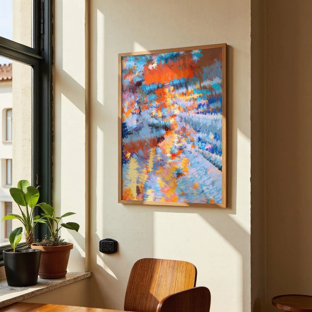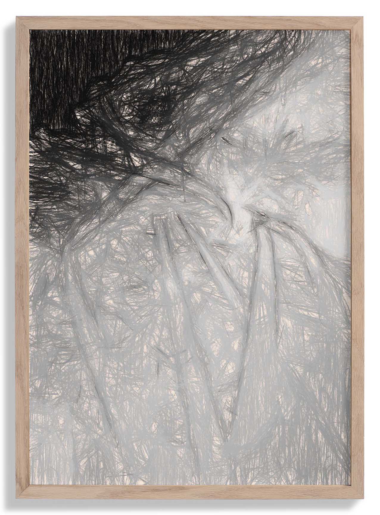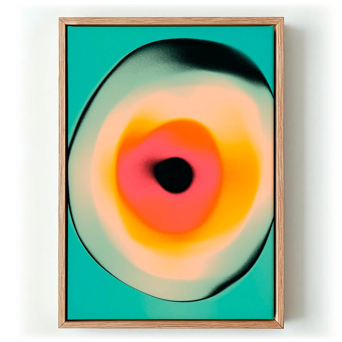
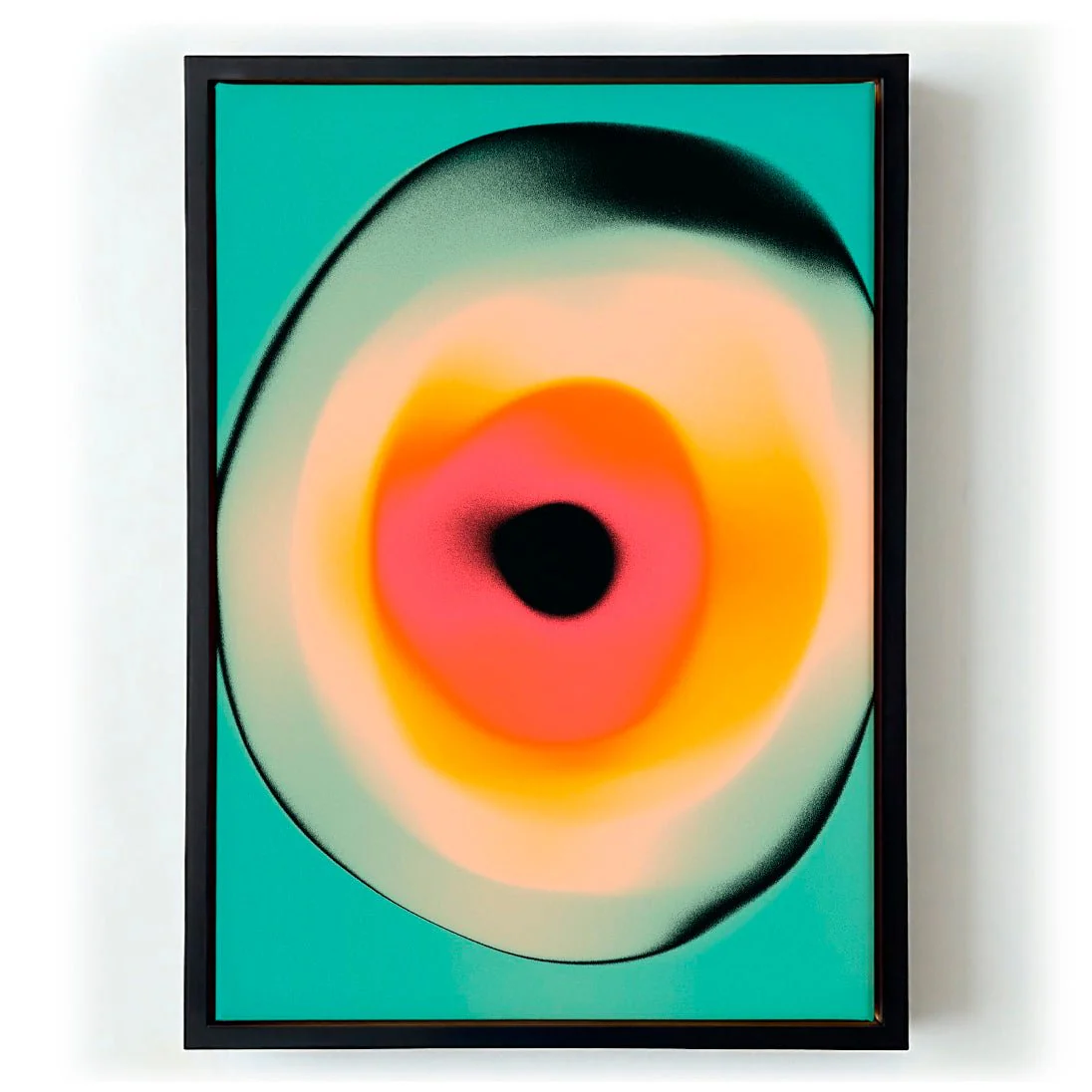
Interzone 1 by Jazzberry Blue
Interzone 1 occupies the territory between order and flux. Jazzberry Blue builds the composition from hard-edged geometric forms that seem to shift and negotiate with one another across the picture plane — zones of colour pressing together, intersecting, creating something that feels both structured and in motion. The palette moves from warm to cool in deliberate steps, generating visual depth without the need for perspective. It is a work about thresholds: where one colour ends and another begins, where a shape becomes something else entirely.
Printed as a canvas print in our Berlin studio, the textured cotton surface brings out the vibrancy of each colour zone and adds a warmth that elevates the graphic composition. Archival pigment inks ensure the palette stays true for generations.
Original: $44.15
-65%$44.15
$15.45More Images
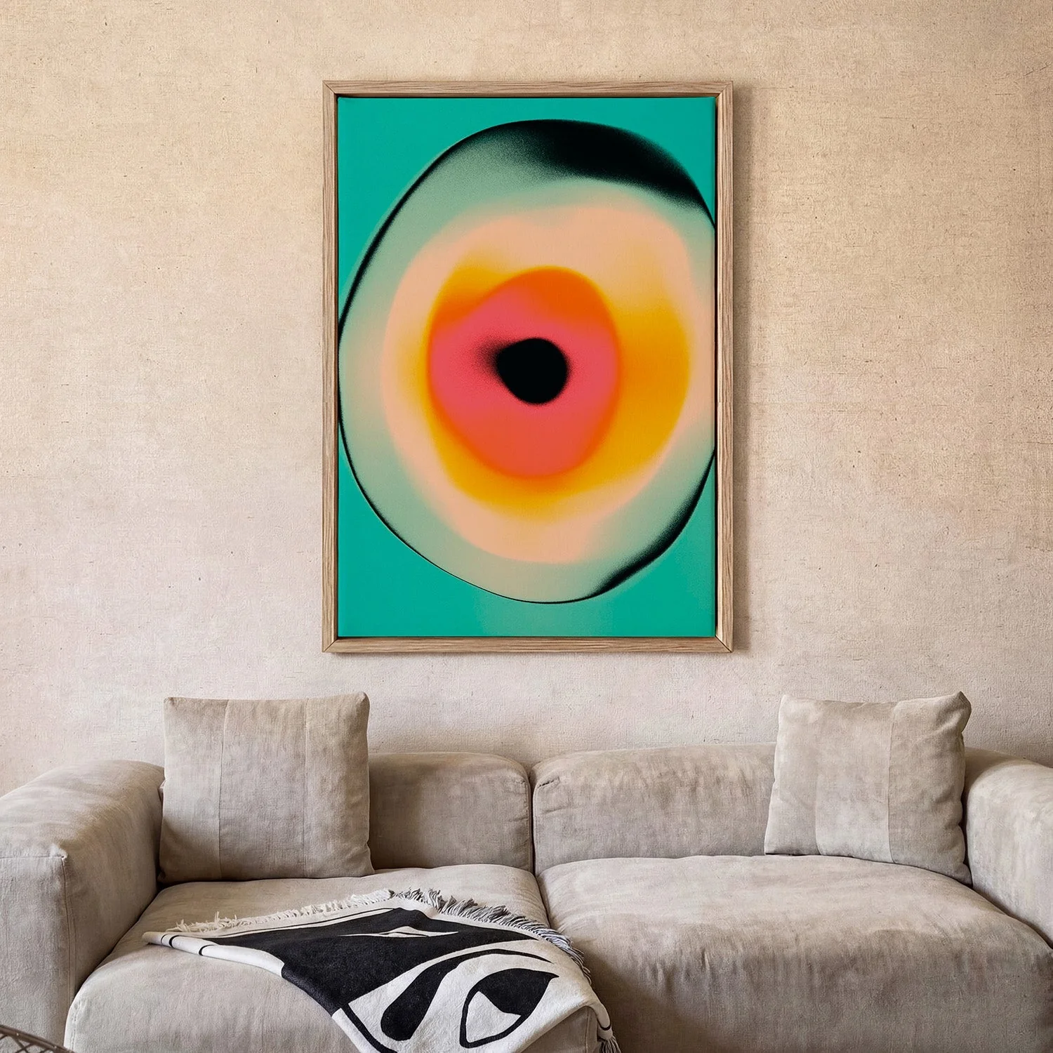

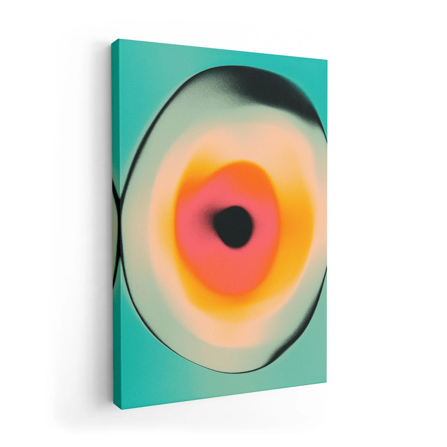
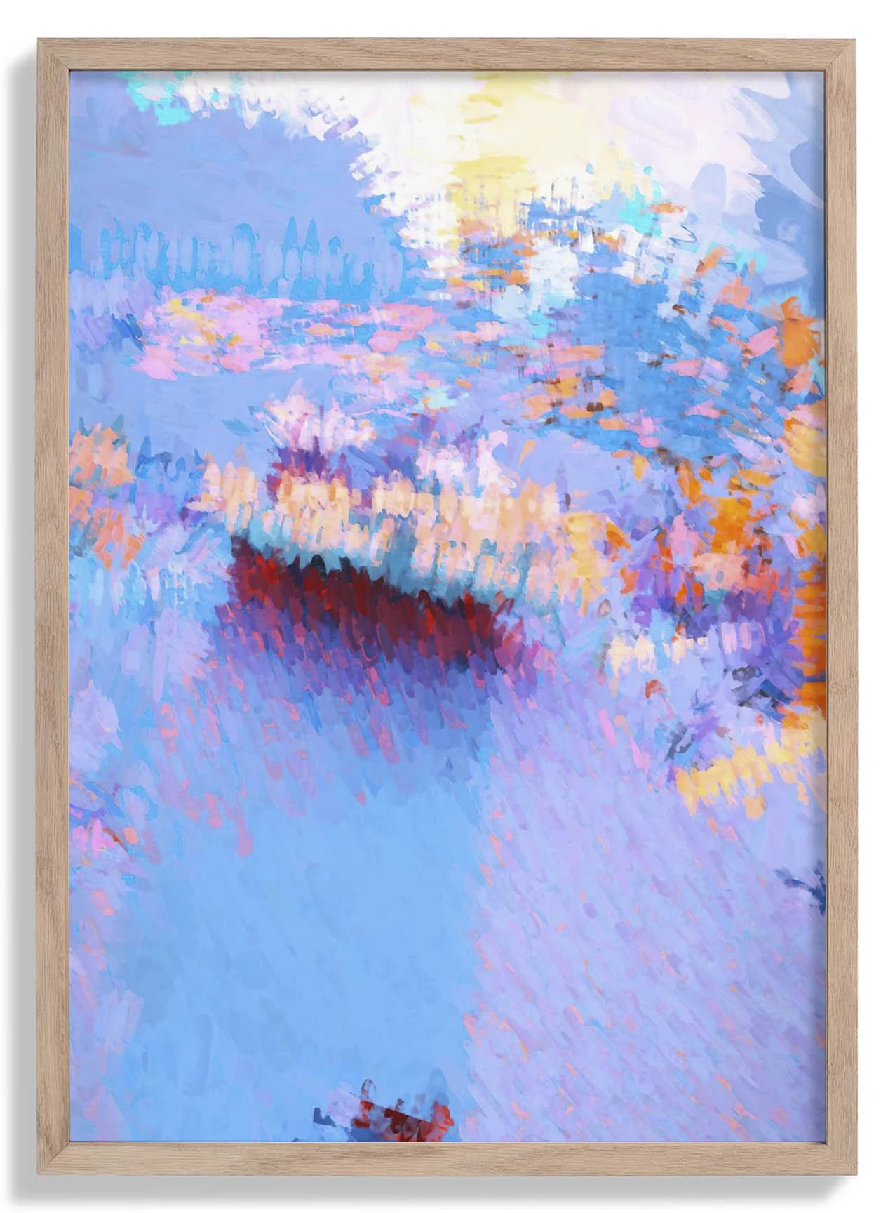
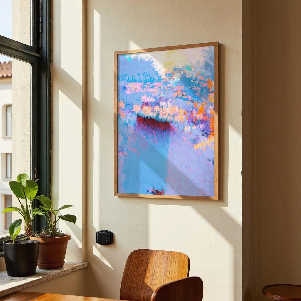
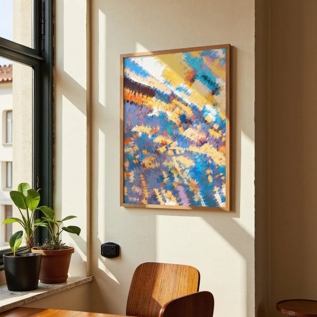
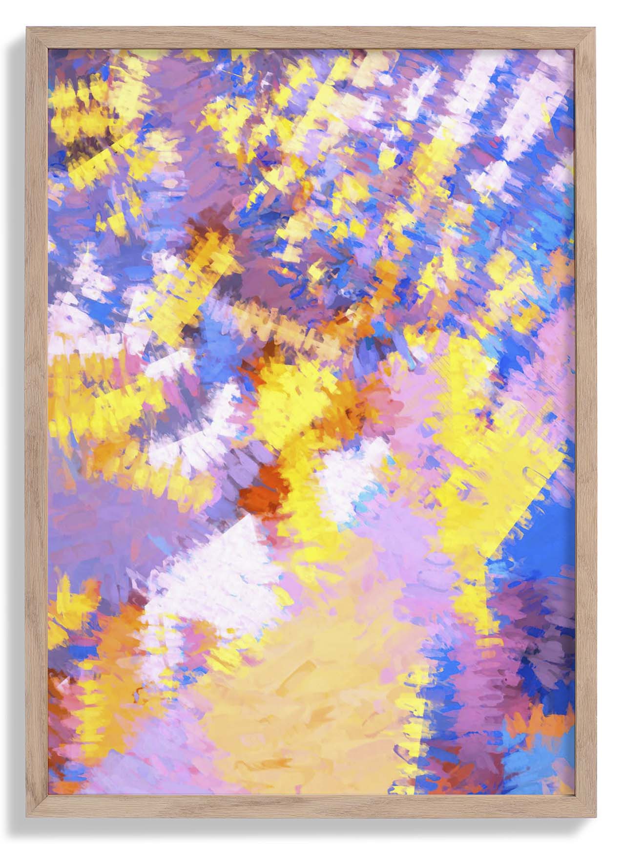
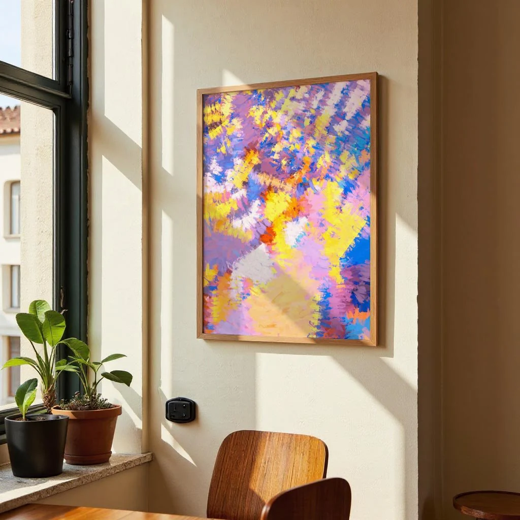
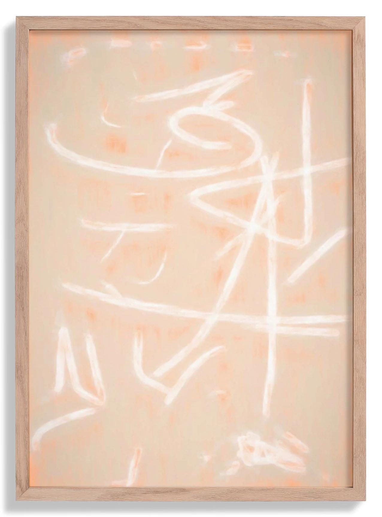
Interzone 1 by Jazzberry Blue
Interzone 1 occupies the territory between order and flux. Jazzberry Blue builds the composition from hard-edged geometric forms that seem to shift and negotiate with one another across the picture plane — zones of colour pressing together, intersecting, creating something that feels both structured and in motion. The palette moves from warm to cool in deliberate steps, generating visual depth without the need for perspective. It is a work about thresholds: where one colour ends and another begins, where a shape becomes something else entirely.
Printed as a canvas print in our Berlin studio, the textured cotton surface brings out the vibrancy of each colour zone and adds a warmth that elevates the graphic composition. Archival pigment inks ensure the palette stays true for generations.
Product Information
Product Information
Shipping & Returns
Shipping & Returns
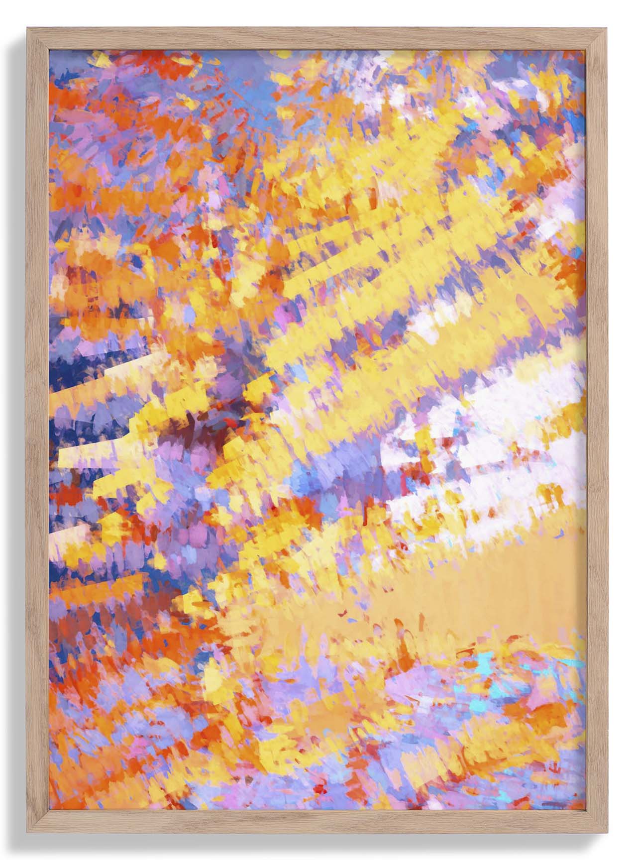
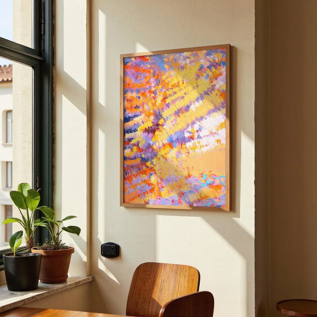
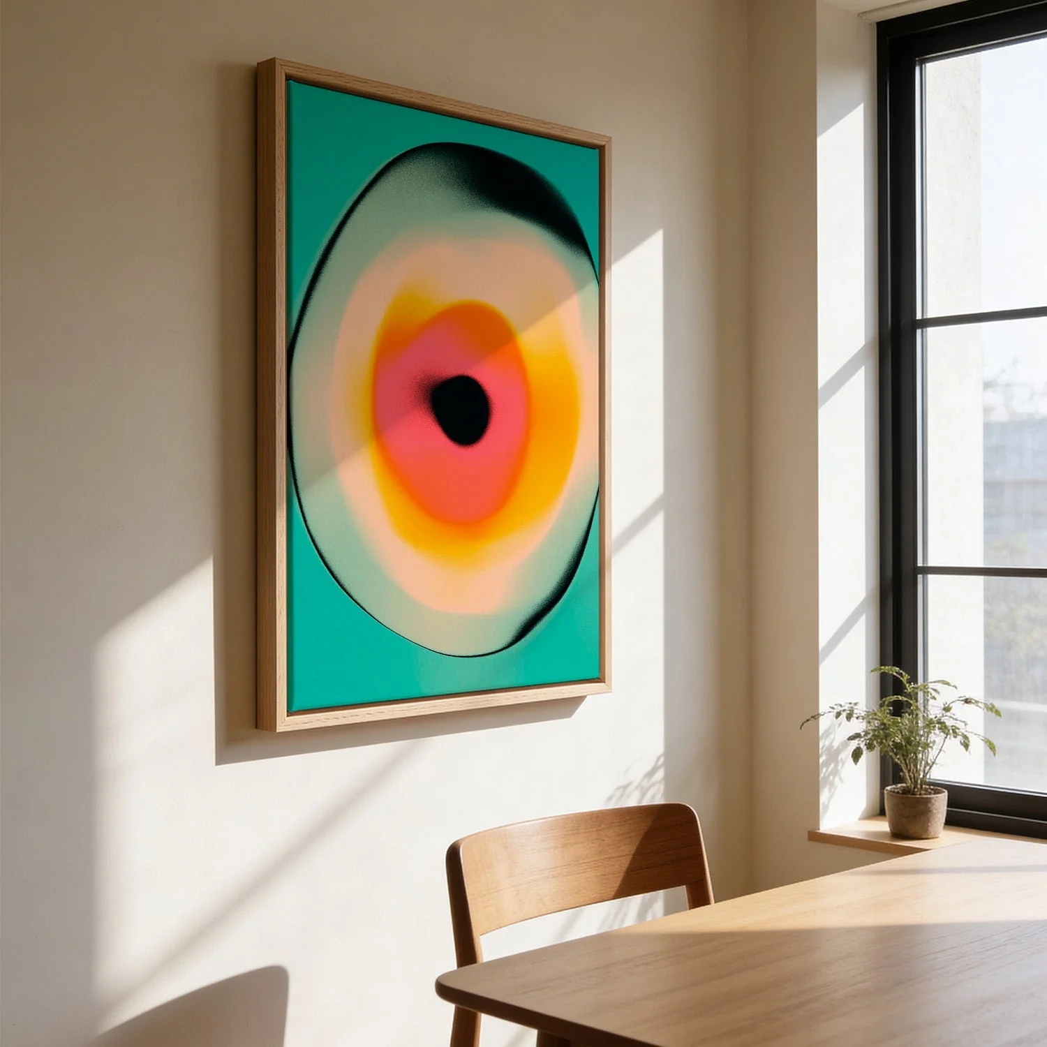
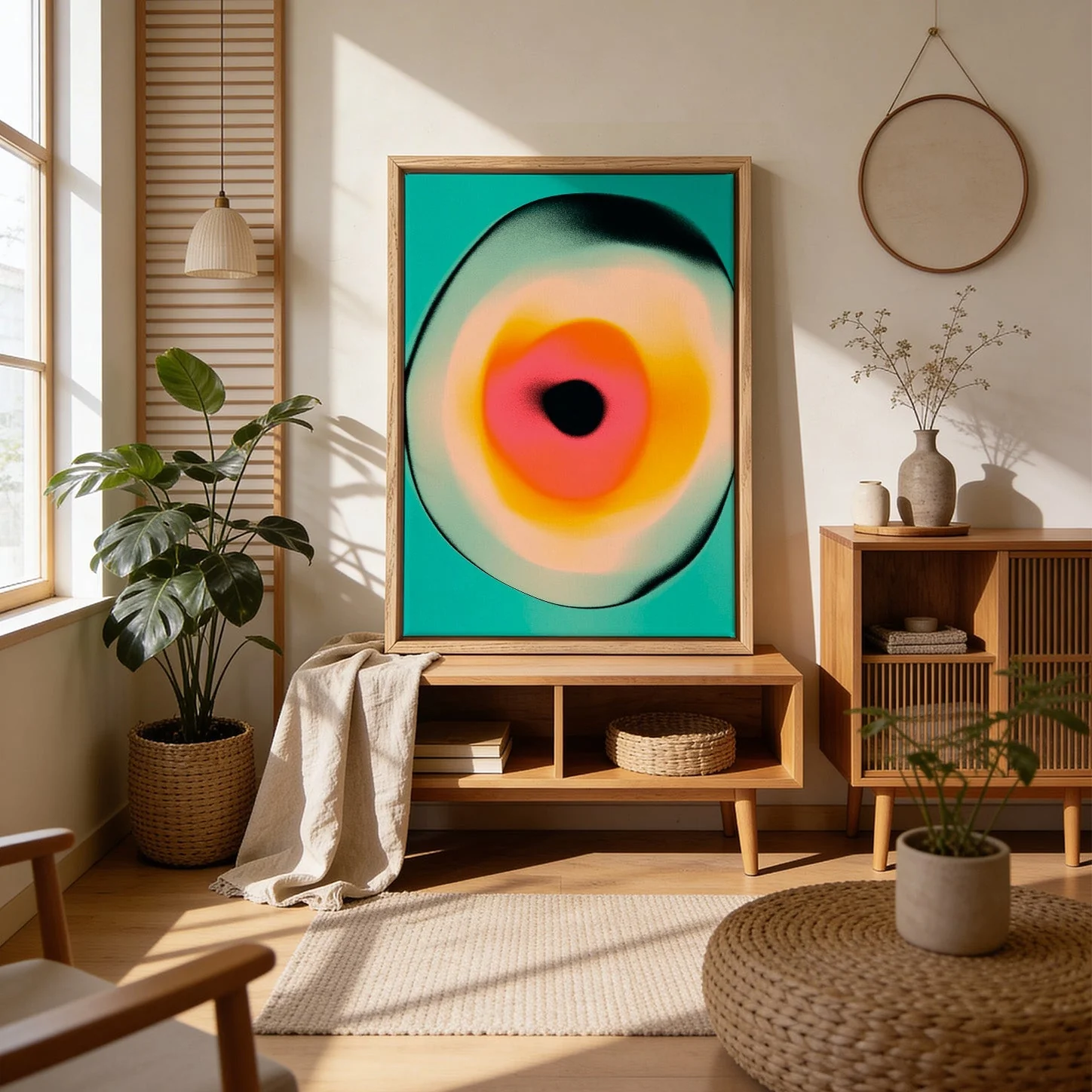
Description
Interzone 1 occupies the territory between order and flux. Jazzberry Blue builds the composition from hard-edged geometric forms that seem to shift and negotiate with one another across the picture plane — zones of colour pressing together, intersecting, creating something that feels both structured and in motion. The palette moves from warm to cool in deliberate steps, generating visual depth without the need for perspective. It is a work about thresholds: where one colour ends and another begins, where a shape becomes something else entirely.
Printed as a canvas print in our Berlin studio, the textured cotton surface brings out the vibrancy of each colour zone and adds a warmth that elevates the graphic composition. Archival pigment inks ensure the palette stays true for generations.