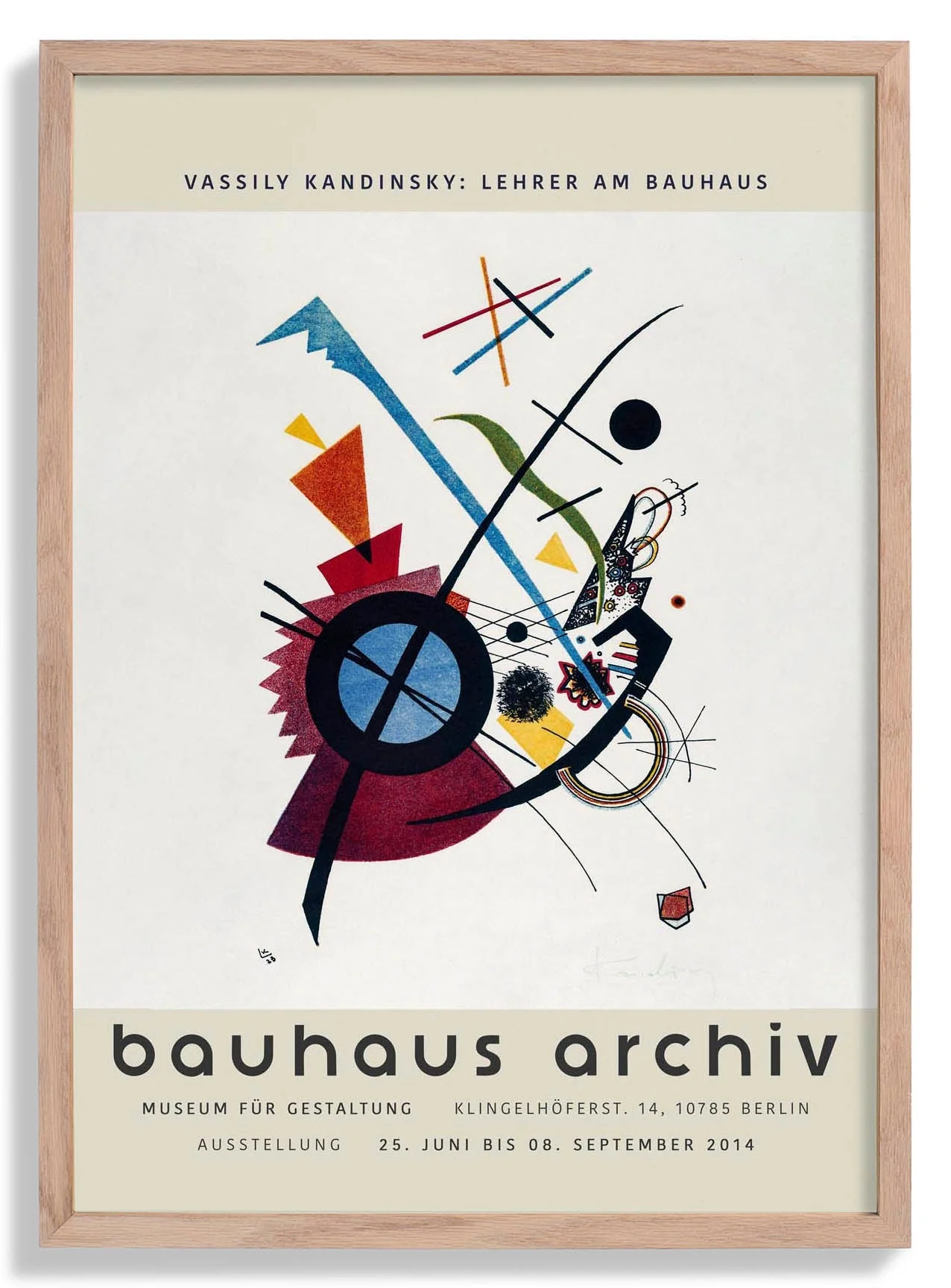
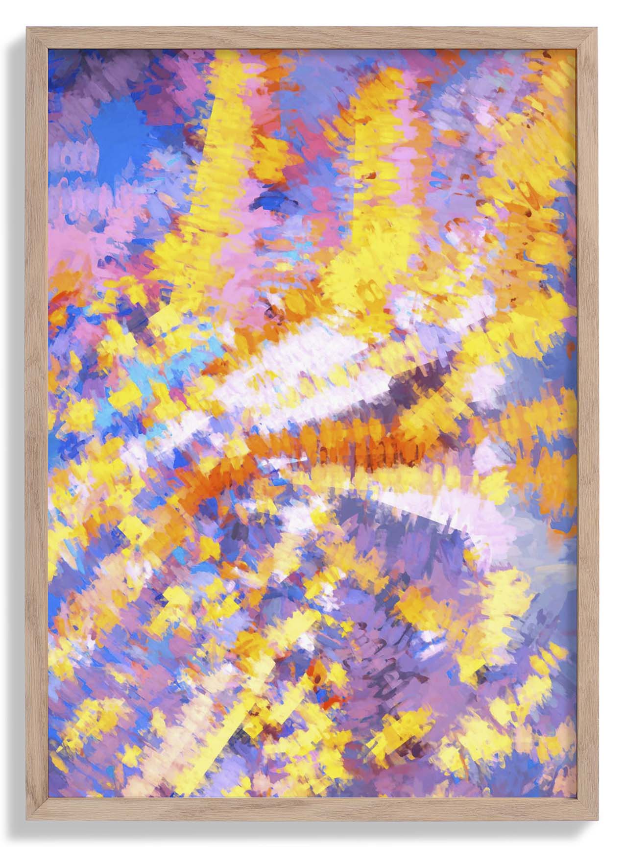
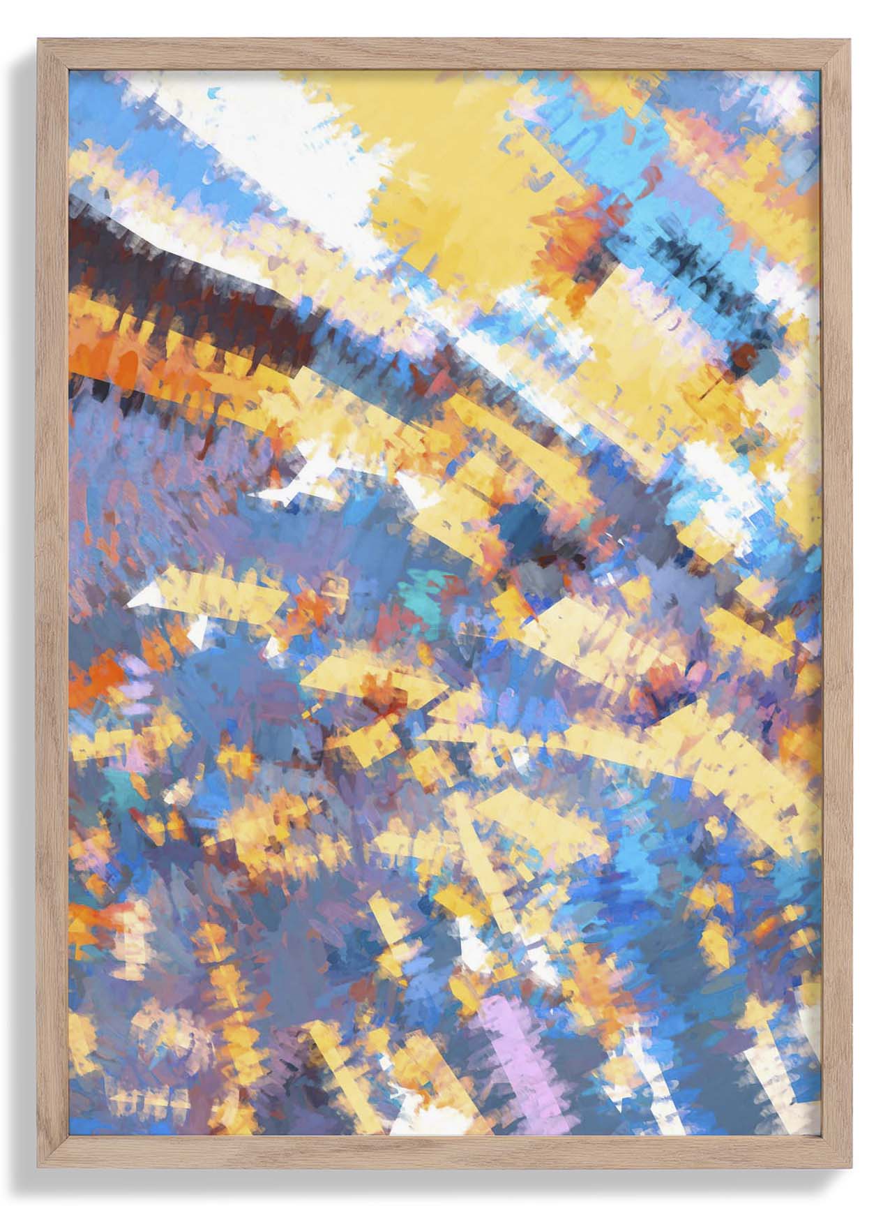
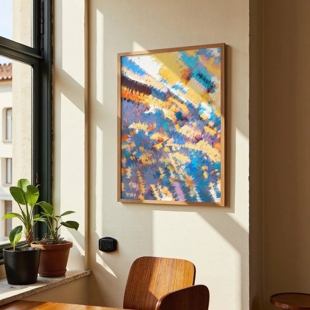
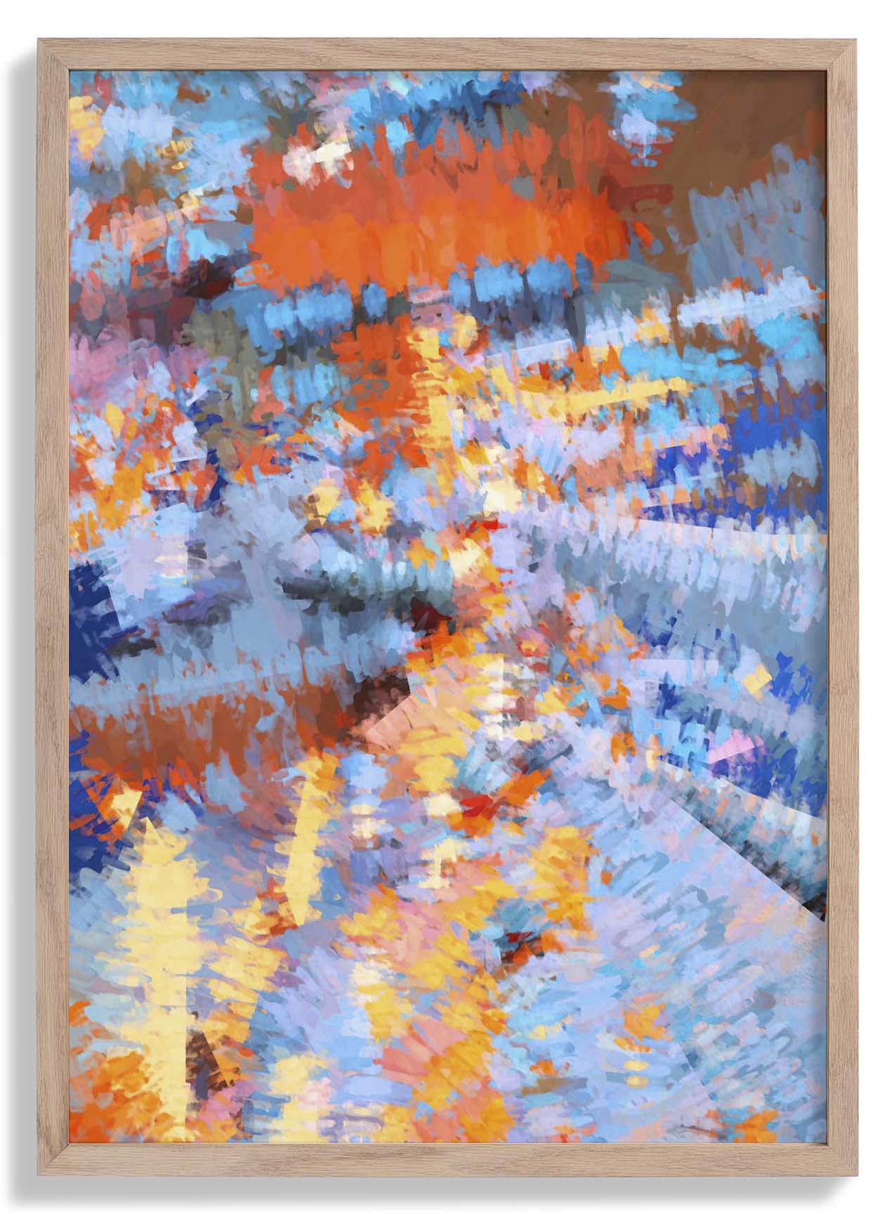
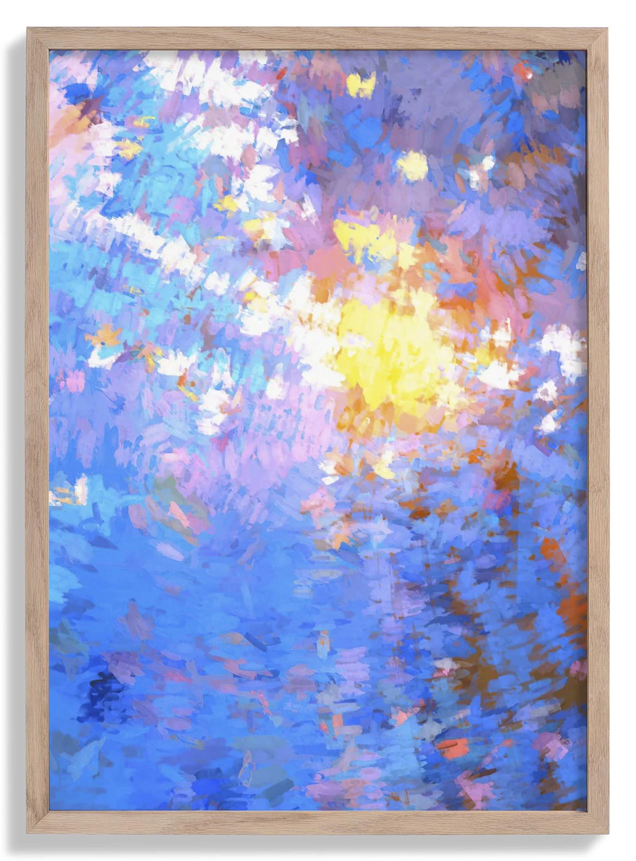
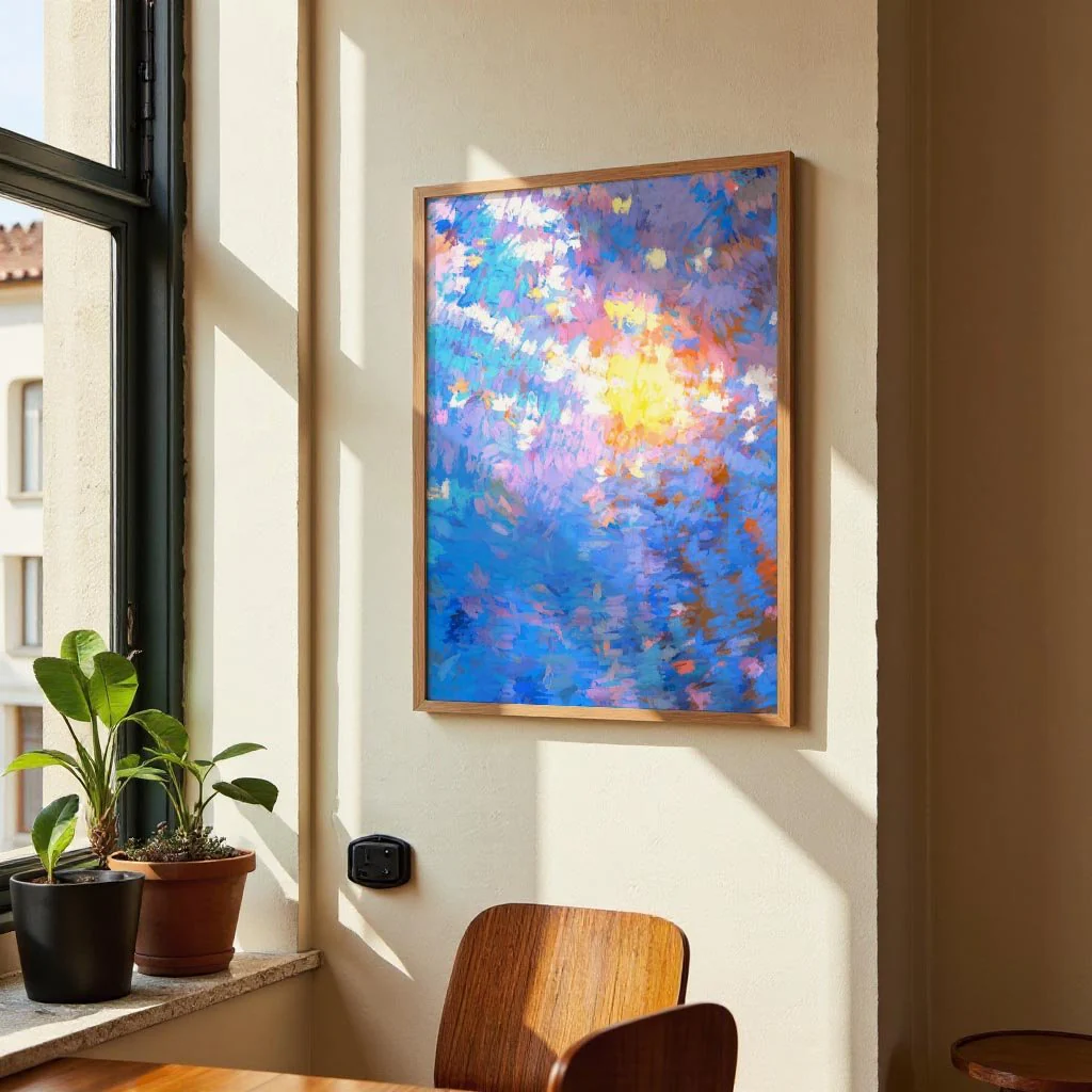
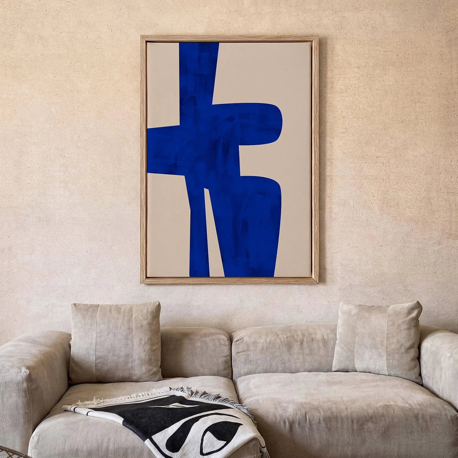
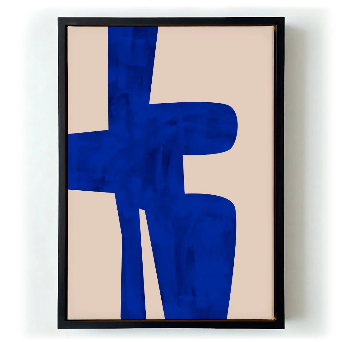
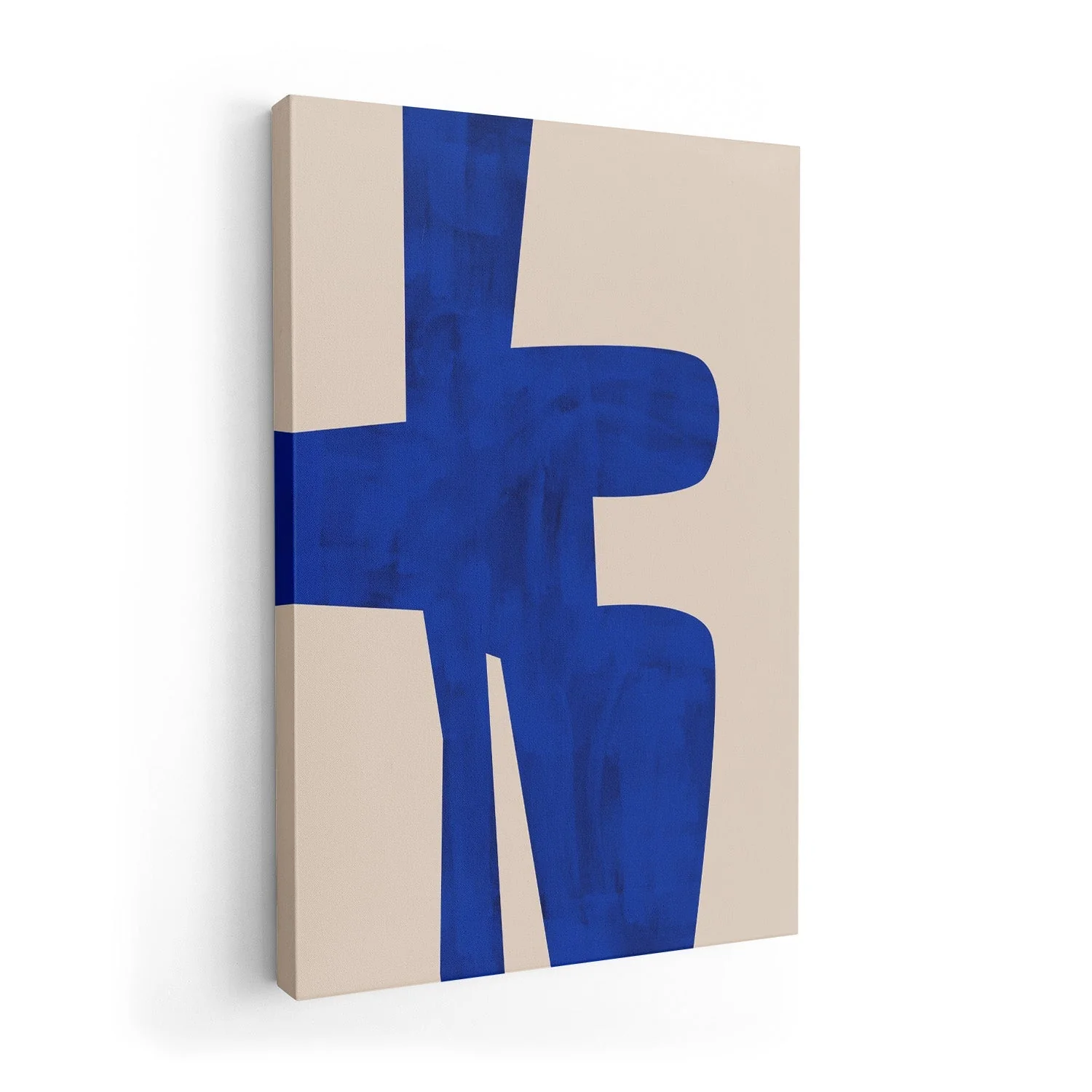
Blue Harmony Shape by Elena Ristova
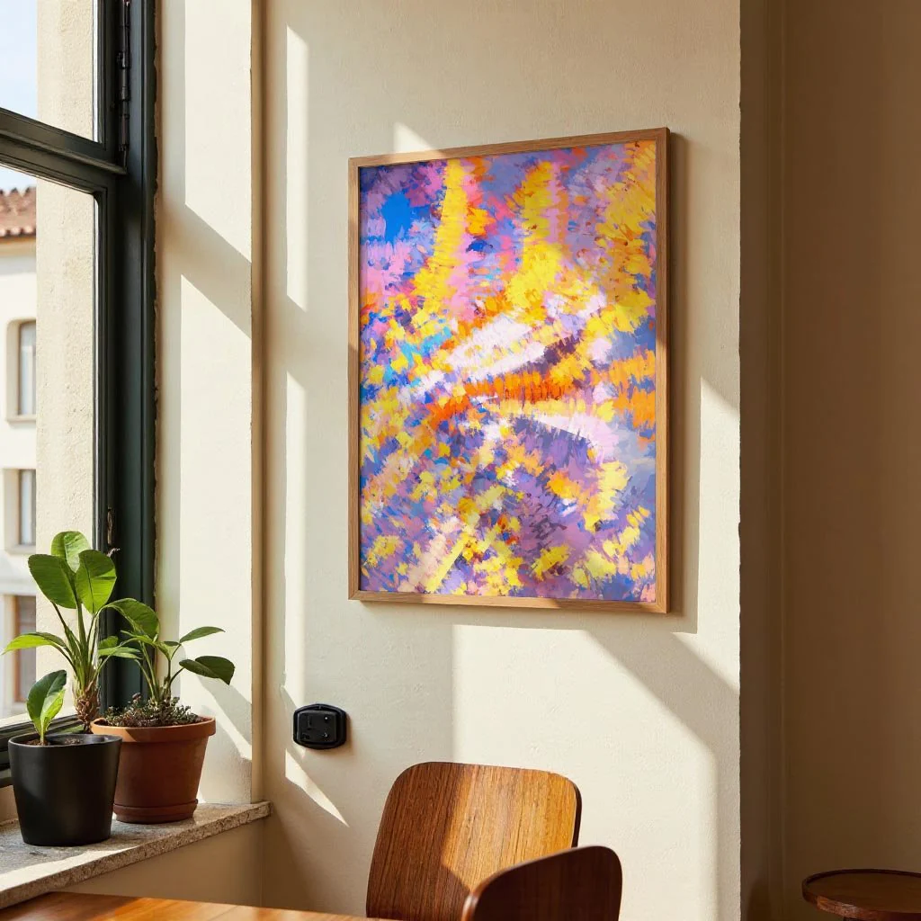
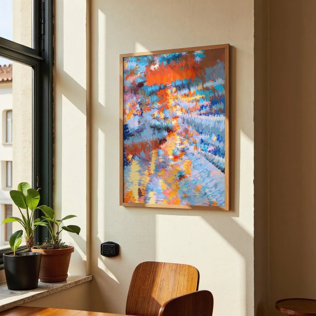
Blue Harmony Shape places a single composed form at the centre of a quiet, considered composition. Ristova's choice of blue — measured, neither cool nor overwarm — carries the weight of the work with ease, the shape sitting against its ground in balanced equilibrium. The title's word 'harmony' is not incidental: this is a work built on the relationship between form, colour, and the negative space that holds them. Drawn from a graphic design and screen-printing tradition, the piece has a flatness and clarity that reads as both modern and resolute, without leaning into minimalism as a style statement.
On canvas, the blue takes on a depth and warmth that flat paper cannot offer. The woven texture gives the solid form a subtle surface variation, turning a graphic composition into something with genuine material presence. A canvas print for walls that favour calm, considered colour.
Original: $44.15
-65%$44.15
$15.45More Images
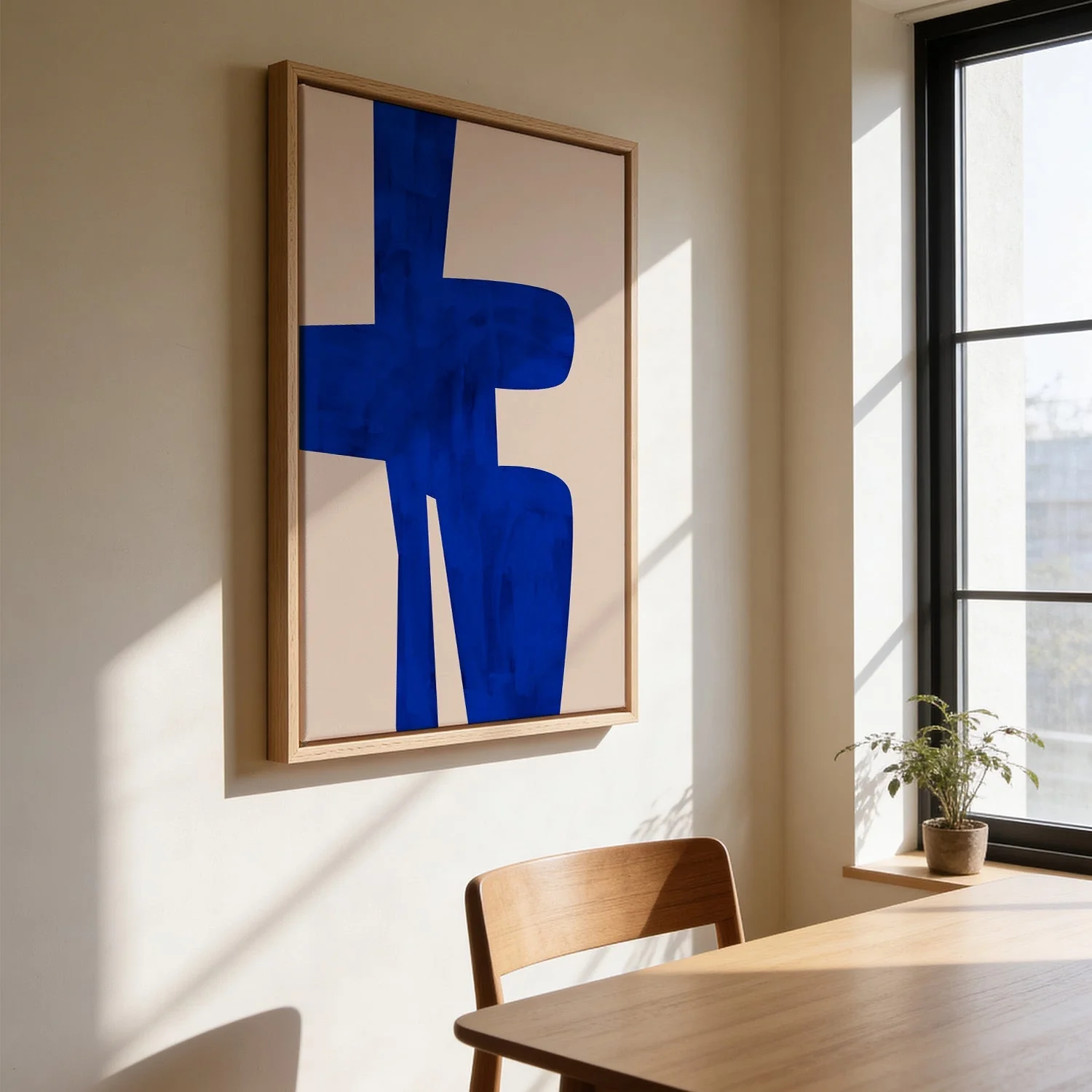

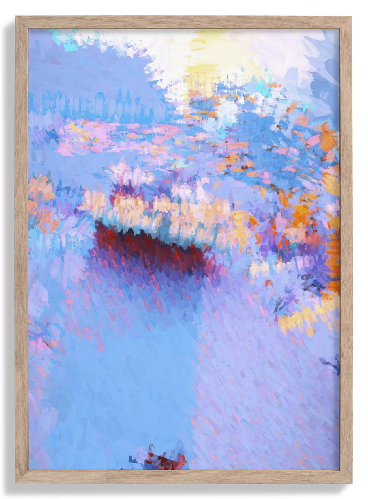
Blue Harmony Shape by Elena Ristova
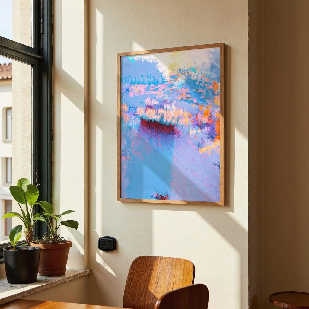
Blue Harmony Shape places a single composed form at the centre of a quiet, considered composition. Ristova's choice of blue — measured, neither cool nor overwarm — carries the weight of the work with ease, the shape sitting against its ground in balanced equilibrium. The title's word 'harmony' is not incidental: this is a work built on the relationship between form, colour, and the negative space that holds them. Drawn from a graphic design and screen-printing tradition, the piece has a flatness and clarity that reads as both modern and resolute, without leaning into minimalism as a style statement.
On canvas, the blue takes on a depth and warmth that flat paper cannot offer. The woven texture gives the solid form a subtle surface variation, turning a graphic composition into something with genuine material presence. A canvas print for walls that favour calm, considered colour.
Product Information
Product Information
Shipping & Returns
Shipping & Returns
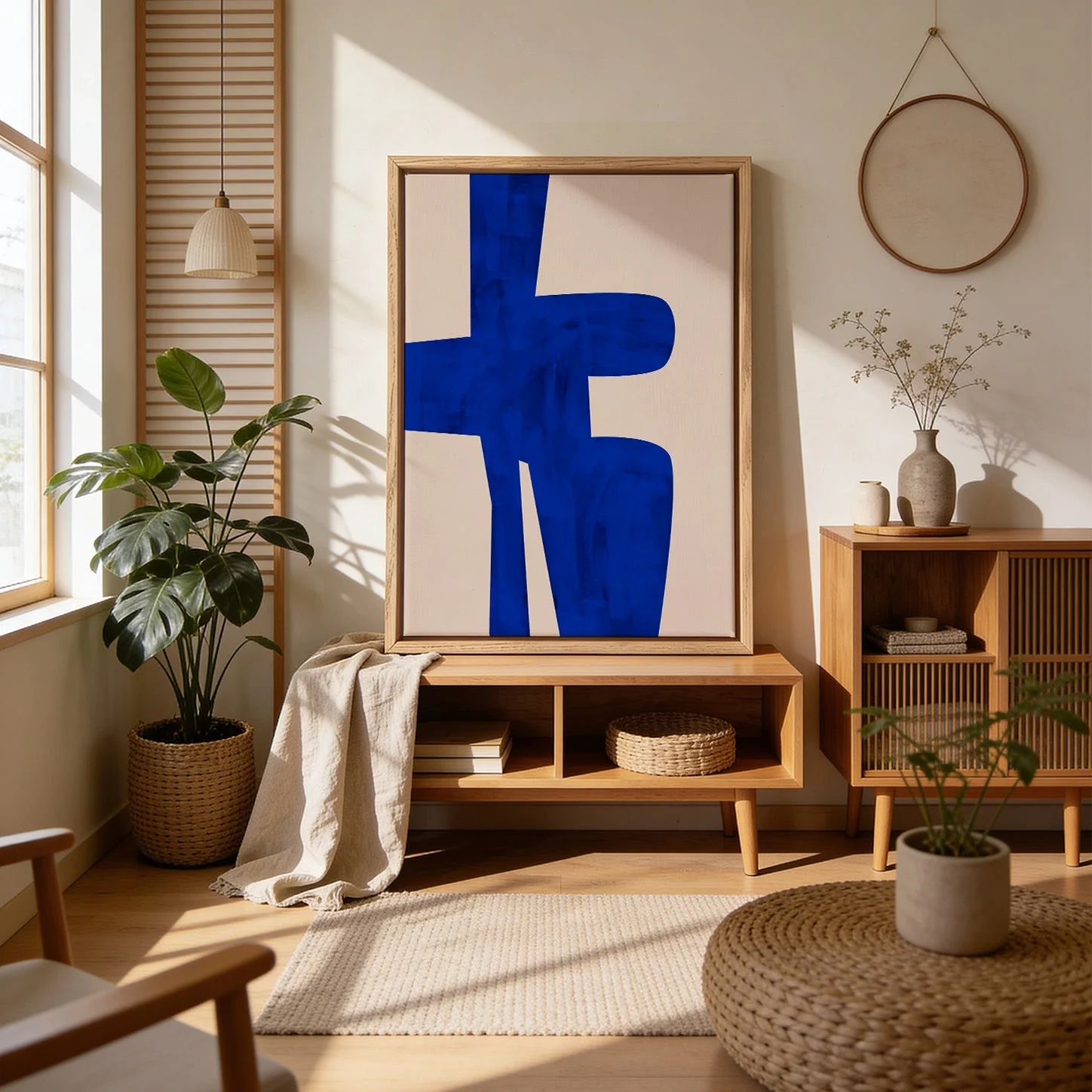
Description
Blue Harmony Shape places a single composed form at the centre of a quiet, considered composition. Ristova's choice of blue — measured, neither cool nor overwarm — carries the weight of the work with ease, the shape sitting against its ground in balanced equilibrium. The title's word 'harmony' is not incidental: this is a work built on the relationship between form, colour, and the negative space that holds them. Drawn from a graphic design and screen-printing tradition, the piece has a flatness and clarity that reads as both modern and resolute, without leaning into minimalism as a style statement.
On canvas, the blue takes on a depth and warmth that flat paper cannot offer. The woven texture gives the solid form a subtle surface variation, turning a graphic composition into something with genuine material presence. A canvas print for walls that favour calm, considered colour.